Hello everyone and welcome to the channel. Today Google released Android 16 QPR1 beta 3 that I have on my Pixel 9 Pro XL to show you everything new. So without further ado, let's jump in to show you all the new changes. On the left I have Android 16 QPR1 beta 2.1 and on the right I have beta 3. So let's start with the lock screen. The first thing you will notice here is the solid color of the notification pill.
If you have the compact view option activated, then the weather icons are back again to the same design of the stable version of Android 16, which is the 3D design. Also, you will find here that the at a glance widget is using a much bigger font. Now, let's talk about the home screen. And the first change is the widgets animation.
And as you see in 2.1, the widget itself will expand to fill the entire screen before showing the app. But in beta 3, it's back again to the same animation we used to have in the stable version of Android 16. The second change is when you try to reorder your home screen items. We are back again to the same way of the stable version of Android 16, which you can see the next home screen page. But we lost this functionality in the first beta versions of QPR1. But now you can see your next home screen page. So you can get an idea about what you are heading to.
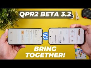
Moving to the quick settings, we only got one minor tweak in the media controls. When you go to the media output switcher, you will see that the current device icon is now on the right and instead of the left. Before jumping to the next chapter, let me tell you about the ceremonic air wireless microphone. It's a comprehensive system which is a great option for content creators and it's kind of nuts how much you get when you buy. First, a transparent charging case with a built-in 1300 milliamp battery, enough to charge your microphones more than 1.5 times. And the whole setup, including the case, can be charged with a single USBC cable.
Then you get two transmitters with built-in microphones. And they can also use the included lavalier mics for high quality sound. Plus, they all come with wind screens, which are super easy to uninstall. You get a single receiver that can be used with USBC for phones, and for professional cameras, you can use the same receiver with a TRS cable. And if you have a Sony camera that has a digital multi-interface, too. There is a $29 optional adapter that gives you 100% wireless connection, so you don't need to deal with any cables. One cool feature is that the receiver has a USBC port, so you can actually charge your phone while the receiver is plugged in and this way you have continuous power.
Another super important feature is that the receiver has a headphone jack, which means that you can actually monitor audio in real time to identify any issues and correct them. As far as how to attach the microphone, each transmitter has a tiny magnet on the back to easily snap it into place or use the built-in clips. As far as audio quality, it's impressive with two levels of active noise cancellation.
And here's a quick sample in a noisy environment. This is how it sounds without the active noise cancellation. This is how it sounds with the weak active noise cancellation. And finally, here is how it sounds with the strong active noise cancellation. If you are interested in the Ceremonic Air, you will find all the links in the description. And now, let's get back to the video. So that's it when it comes to the userfacing changes. Now let's talk about all the new changes under settings. Let's start with the appwide changes and the first one is the less spacing between the different categories. So you can see more on the screen without scrolling. The second change is the redesigned floating cards. So let me try to show you one of them. As you see it got this new design. And now let's talk about the specific changes. And I will start with the connected devices menu and then connection preferences.
The first thing you will notice here is the cross device services menu is now located under connection preferences which wasn't the case before. Previously to access the same menu you need to go to profile and then all services and you will see the cross device services over here. So this one will make it slightly easier to reach. The second change under the same menu is located under NFC and then contactless payments. You will see here that the page got redesigned to support material 3 expressive. And you will see the same under the apps menu.
For example, when you go to the permissions page of any app, you will see the same Material 3 expressive redesign. Also, when you go to the default apps, you will see the same. Under sound and vibration, the icons next to the sliders are now aligned properly, unlike beta 2.1, and the bold font used in the headers is now gone. Plus, Google updated the menu names. The phone ringtone menu is now called ringtone alert. Same as the default notification sound is now called notification alert. Moving to the display and touch menu. You will see here that the auto rotate menu item looks different.
It has an arrow to let you know that you have more options underneath it. Plus, you get a quick toggle over here to turn it on or off. And if you have any of the Pixel 9 models, the backup or copy data menu got the material 3 redesign. Under battery, if you have any of the models that support the battery health feature, it's back again with the proper battery capacity because some people lost this feature in one of the betas of QPR1. Moving to the system settings, when you go to gestures, you'll see that the one-handed mode is now added to the list instead of being only accessible from the accessibility menu like before. Also under system, when you go to the backup page, you will see a complete revamp. First, you will see a banner at the top with the device name, the backup status, and a much bigger backup now button, a small description.
And the backup details are now simplified. We only have two items, photos and videos, and other device data. Previously, we used to have each data type showing on the screen with the amount of storage used per each one. But now we have a consolidated amount of storage for everything. It says here 100 MGB plus it shows the time where your last backup took place. None of these items are tabable on the previous version only photos and videos and both take you to Google Photos. But now when you tap on the other device data, you will get a much simpler page which will tell you what type of data it will back up to your Google account. Then you have a toggle to turn this feature on or off.
Your Google account, the overall storage used and you have two buttons here to clean up your storage or another one to get more storage and both take you to the Google one app. And lastly, the backup using mobile data option is located under the other device data page. Moving to the security and privacy page. For some reason, beta 3 lost the material 3 expressive redesign and you are back again to the same design of the stable version of Android 16. In contrast, the privacy dashboard got the material 3 expressive redesign. And then we have the passwords, pass keys, and accounts menu. Here you will see a redesigned Google account picker. Instead of having change and open buttons, now we have this arrow which will take you to the sub menu and an edit button to change your service. Last but not least, under accessibility, when you go to the magnification menu, you will see that now we have the option to magnify the keyboard, which wasn't the case before.
And that's what happens when you activate the magnify keyboard toggle. It will simply be included in the magnification. Before jumping to the next chapter, if you like any of the wallpapers you see in this video or any of my previous videos, they are now available on the wallpapers by in-depth tech reviews app. Plus, now you can download the wallpapers locally on device to apply the wallpaper effects of Android 16 on them like I do right now on my wallpaper. As you see, it looks stunning. So, you'll find Google Play Store download link in the description.
And now, let's get back to the video. So these are all the new features I wanted to show you in QPR1 beta 3. Now let's talk about the bug fixes as per the release notes. The first one is an issue around the RTOS or the real-time operating system task list corruption that was causing restarts. And then we have the launcher not completely displaying or in other words the home screen icons sometimes disappear. Then we have the notification display issue. Sometimes the notifications don't render properly. The media player in the notification pulld down fails to fully display and function.
Then we have a full phone restart due to class loader issues. A kernel issue causing restarts. And then we have the camera nonfunctional at startup with black screen. Status bar icons missing corner padding. And finally notification shade message folding brakes. And now it's time to talk about the performance and battery. From my experience while filming this video, I didn't experience any major or minor issues while filming the video with beta 3, and I think it's good enough for your daily driver, especially after the bug fixes I just mentioned. Let me also show you my Geekbench scores. I got 4538 for the multi-core and 1920 for the single core. I did the same test on beta 2.1 and I got pretty much the same numbers but slightly lower multi-core score of 4,448.
And when it comes to the battery, let me show you what happened. I used the phone for 2 hours and 16 minutes. The phone was always connected to Wi-Fi. The screen brightness is 40% and I have my SIM card inside. I lost 18% battery in 2 hours and 16 minutes. And here are the apps I used. So, you are the judge. This is only an initial impression about the battery, but for me, I think it's good enough for the daily driver, and the battery usage is just normal. So, that's pretty much it for today. These are all the new changes I wanted to show you in Android 16 QPR1 beta 3. Please let me know in the comments if I missed anything..