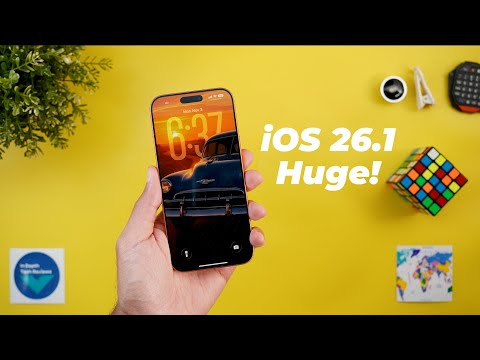
Hello everyone and welcome to the channel. Today is a very exciting day for iOS users. Apple released iOS 26.1 to the public and I have it here on my 17 Pro Max to show you all the new changes. So without further ado, let's jump in. I will start with the lock screen which got a massive number of design tweaks. On the left I have iOS 26.0.1 and on the right I have 26.1. And let's go to the customize page to show you the new changes.
When I go to the same page on both, the first thing you will notice here is the pigeonation dots are no longer surrounded with a container. Plus, the name of the filter is now centered with the lock screen shortcuts. The widget speaker also got updated. As you see here, they look totally different now. The background reflects the colors of the wallpaper a lot more than the previous version.
And the same applies to the other widgets picker as well. But when you go to any of the pages, you will see both look almost identical. This new change is only applied to the first page. The clock customization card is no exception as it got the same liquid glass treatment and the edges now match the phone curvature unlike before. The clock color and font are now highlighted in white color instead of blue. The language card also got updated to match the new design. And as you see here, when I scroll through the clock colors, I no longer get the small bounce I used to have in 26.0.1. It's now more stable. Plus, the glass and solid switcher is now a lot bigger and easier to deal with. Finally, the X at the top right corner is no longer showing. And that makes sense because you can simply dismiss the card like this or tap anywhere on an empty space. When it comes to the lock screen shortcuts, I spotted two new changes.
The first one is the removal of the visual intelligence shortcut from the lock screen and the accessibility reader icon got updated. Now the border is in gray color instead of white. Last but not least, I started to notice that iOS 26.1 is better in handling the spatial scene feature along with the depth effect. So in this example, I have the same exact wallpaper and the depth effect is enabled on both. But when I turn on the spatial scene on both versions, you will see here that 26.1 is a lot better in handling the depth effect while 26.0.1 removed it entirely. And by the way, if you like any of the wallpapers you see in this video, you will find the download link in the description.
It will take you to my Patreon's page where you can download the full collection. And now let's talk about the home screen. The first change you will see here is related to the folders. Now the name is left aligned and much closer to the folder unlike before. And in the edit mode, the text box that you use to change the folder name got the liquid glass design. Plus, it's now using rounded edges instead of a rounded rectangle. The home screen customized card also got some visual tweaks. Now, the margins around the card are smaller to make the card a little bit wider and taller. Plus, all the options are now pushed further down, leaving a bigger margin between the card header and the options you have on the screen. Plus, when you choose any of these options, the extra ones you have here at the bottom are also pushed further down.
Now let's talk about the home screen widgets as Apple redesigned some of them. Starting with the battery. Now the text is in white color instead of black which looks a lot better in my opinion. And the same applies to the home widgets. They are also using white icons. Moving to the screen time widgets. You will see more contrast between the different sections. Instead of using only one color for everything now you see light gray and white. And that's the case in pretty much all of them. The sleep counter widget also got updated and now it uses a white background in sof light gray.
Maybe it looks the same on camera, but I can see it in real life. The stocks widgets are now using a slightly darker background color, which is hard to see on camera as well, but I can see it in real life. When it comes to the wallet widgets, they are now using a white color instead of a light gray background. Moving to the notification center, I spotted one small visual tweak. when I tap and hold on any of the notifications on the previous version, you will notice here a glowing animation around the edges of the notification banner. While now when I do the same on iOS 26.1, it doesn't do the same. As you see, it animates normally without any glow around the edges. Now, it's time to talk about the new changes in Apple apps. And I will start with the camera. The first change here is related to the timer. So when you tap on the timer on the previous version, you get this chip that will allow you to choose the duration.
While now when you tap on it, it doesn't do the same. It allows you to switch between these presets by just tapping multiple times on the button. The second change is the different high efficiency format name. Previously, it used to be called HEIC while now it's called heath. And the last change is under the camera settings. When you scroll all the way down, you will see a new toggle called lock screen swipe to open camera. If this toggle is activated, anyone that has access to your phone can swipe left and use the camera, which might put you in trouble. So, if you don't want this to happen, you can turn off the switch. So, let me go back to settings. Once I turn off the toggle and go back to the lock screen, the lift swipe is no longer working. You should also consider removing the camera shortcut from your lock screen to avoid the unauthorized access entirely. And this feature is also useful for those who want to avoid opening the camera accidentally.
The next app we have is the calculator which got multiple design tweaks. The first change is the updated icons at the top. Both are different now. Plus the history card is now in liquid glass instead of using a solid background. The third change is the redesigned math notes page. So when I open it on both, you will see that the header is now a lot smaller, centered, and shifted towards the top. Plus, if there is nothing written, you see this no notes text unlike before. And lastly, when you stretch any of the buttons like this, the intersection points with the other buttons around it are not as liquid glass as they used to be. Moving to the calendar, which got a small design tweak. When you go to the calendars page, you will see that the tick button got replaced with an X. And the same applies to the invitations button. Here we have an X instead of the tick. Now, let's talk about Apple Music, which got a lot of design tweaks and features. The first one is the ability to skip tracks by swiping left and right on the mini player, which wasn't the case before.
Similarly, when you open the now playing screen, you can swipe over the song text. While previously your only way is to use the buttons. And there is a small tweak in how the text animates when you skip tracks. In 26.1 when you skip tracks, as you see the artist and the song name appear together, while previously the artist name animates after the song name.
Tapping on the ellipses reveals even more differences. The first one is the updated icons at the top. They now have a fill color instead of using outlined icons. We got a new option here called go to artist. Not only go to album like before. Plus those two options will show you the album name and the artist name beforehand. But when you play songs from a playlist and then expand the menus, you will see another difference. Instead of having go to album, now you have a drop-own menu called go to. And when you tap on it, it shows three options.
Go to playlist, go to album, and go to artist. Another small tweak is when you toggle the music haptics, the glyph icon animates, which wasn't the case before. And with iOS 26.1, it seems like Apple did fix the swipe up animation to expand the now playing screen, which was broken in the previous version. Last but not least, it seems like Apple updated the automix animation that take place when the app switches between tracks. So, let me show you how it looks on 26.1. You will see here that it's more obvious on the newer version, while the previous one was a bit more subtle.
So, that's it with Apple Music. Now, let's talk about photos. And there are multiple tweaks to the video player. The first thing you will notice here is the scrubber. The buttons are now grouped together in one container. Instead of having the two lines design like before, plus when you start scrapping the buttons disappear, the container expands to show the time. While previously the design was more basic. Plus, the text and the icons at the top are now more visible, which is nice. And when you hide and reveal the items, as you see, the animation in 26.1 looks a lot better. and more solid, while previously it had these weird flashes before showing on the screen. Another great change to the video player is when you preview a full screen video, which is usually a screen recording, it shows the video in a smaller size by default with all the buttons and text overlaying on the screen.
But if you want to view it in full screen view, you need to tap on it. And in this case, it hides everything. And the reason this new change is great because as you see here in this case, all the buttons and text on the screen are barely readable on iOS 26.0.1. So no matter what you do, the text is barely readable. While now when you tap on the video, it becomes smaller and everything is clearly visible on the screen. When it comes to the photos, when you tap and hold on any of the items, you will see a more compact context menu because the share, favorite, and delete options are now showing horizontally at the top to save some space.
And you will see the same in the multi- selection mode. When you tap on the ellipses on both, you will see the same design tweak. Play as a slideshow, favorite, and hide are also showing at the top horizontally to give you a more compact card. Plus, the cancel button has been replaced with an X to also save some space. Under collections, when you go to the memories page, you will see a bigger selector at the top. So, that's it with Apple photos. Now, let's talk about Safari. And the first change is in this menu. You will see here that all the items are now using a gray background color, which adds more contrast between the background and the items. And that also makes the text more readable. and overall it looks better. The background color of the ellipses menu also got updated and it's now more opaque when compared to the previous version and that also makes the text more readable.
There are also a couple of tweaks to the tap switcher. The ellipses menu is more transparent in the newer version. And when you go to the manage tap group, you will see that this floating card is also more transparent in comparison. Next, the phone app. And the first change is in the keypad. Now, the buttons support liquid glass. Plus, when you tap on them, as you see, they animate, which wasn't the case before. Under contacts, when you open any of the items, you will see a bigger gap between the profile picture and the contact name. Under the phone app settings, there are two changes. The first one is a new toggle called haptics that will allow you to turn off the haptics when a call is connected or dropped. And also the hold assist detection toggle got redesigned and now the description is showing outside the container. So it looks same as all other toggles in the page. Next, the clock app. And the first change when you set a timer or an alarm, you get a slide to stop option on the lock screen instead of using a button to dismiss the action.
And the second change is under the clock page. when you tap on the plus to add a new city. You will see that the X button is now located on the left instead of the right. So that's it with the clock. Now let's talk about the fitness app. And the first thing you will notice here is the smaller summary header at the top. And when you go to fitness, they are identical, but under workout, it's also shifted towards the top to give more space to the items on the screen. While the sharing tab is exactly the same on both. And when you go to the workout tab, you will see this brand new button at the top right corner that allows you to add a new workout. And here is how it works.
When you tap on select, it shows everything. So you can choose the workout you want. Instead of scrolling down to tap on the plus button like before, not only this, but we got plenty of new options to choose from, unlike the small number of workouts that we used to have. Next, the Junal app. And the first change is under the search. We got this new option called attachments only that didn't exist before. And when you start a new journal, you will see a bigger tools chip on top of the keyboard.
It's wider covering almost the entire width of the screen. Now, let me go through all the apps that only got one new change. And the first one is the find my. When you go to the MI page and then scroll down, you will see that all the notification settings are now grouped together in one container instead of being separated like before. When you create a new reminder in the reminders app, you will see that the keyboard is no longer covering the last two options on the screen. It now works perfectly well. Under the App Store account page, the gray arrows are now using a blue color.
The business news card in the stocks app is now using a dark gray background color instead of black. The Apple TV app got a more colorful icon, but the app itself is exactly the same. And lastly, the FaceTime app should give you a better audio quality in low bandwidth conditions. Apple Maps also got the same design tweaks we've seen in all other apps. For example, you'll see more contrast between the background and the items on the screen, which make things more readable. You will see it also under the profile menu. And when you start the navigation to any place and then expand the card at the bottom of the screen, you will see the same difference. Now we are done with all the apps. Now let's talk about all the new changes under settings. And the first one is an appwide change. When you go to any of the sub menus, you will notice here that all the headers are now left aligned like this. So this is a common behavior you will see in each and every page. But the first functional change we have is under general.
Now you will see a brand new menu called local capture that didn't exist before. This one will allow you to set some settings for the local capture feature. And the first one is the ability to pick a different folder other than the downloads. And you also have an audio only toggle. But the biggest change under settings can be found in the display and the brightness page. Now we have a dedicated menu item for liquid glass. And when you go inside, you can choose between clear or tinted. And as per the preview, you see at the top, clear is the default option we already have for a while, which makes the background more transparent. But if you want to make it more opaque, you can choose the tinted option. So, let me show you a couple of examples. Starting with Apple Music. As you see here, the tinted option makes the text more readable and the background more opaque. And here is how they look side by side.
As you see, it's less transparent with the tinted option activated. And the same applies to all other apps like Apple photos. For example, when I start scrolling, as you see, it's now a lot darker than 26.0.1. The second change under that display and the brightness page is the updated preview wallpapers. They are now using the iOS 26 default wallpaper instead of using iOS 18.
And the same applies to the display zoom. You will see the same change under sounds and haptics. The silent mode toggle is the only one in red color with a bigger icon as well. Under privacy and security, when you scroll all the way down, you will see a brand new page called background security improvements. And when you go inside, you have an automatically installed switch. It says background security improvements provide additional protection to your iPhone in between software updates. So you can activate this feature if you want and we didn't have it before. And lastly, under accessibility and then touch, we got a brand new toggle at the end called prefer single touch actions.
When you take a look at the description, when you turn on this toggle, it will replace any sliding action with a button. If you remember, I showed you earlier that the clock app is now using a slide action instead of the stop button. But now you can turn on this toggle to revert back to the same button action. So let me show you how it works. As you see, it will not give me the same slide to stop, but now I have a normal button. So that's pretty much it for today. These are all the new changes you need to know about iOS 26.1. Please let me know in the comments if I missed anything. But for now, thanks so much for watching and see you in the next.