Hello everyone and welcome to the channel. Another video, another Android 16 update, but this time it's a QPR1 beta 2 that I have on my Pixel 8 Pro. And there are some really exciting features that you need to know about. So without further ado, let's jump in. Starting with the build number and the update size, it was about 396 MGB on the 8 Pro and the build number is BP31.250523. 255023.006. And now let's take a look at the new features.
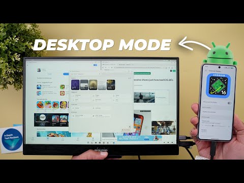
The most exciting change in this build by far is the new desktop mode. Now you can connect any Pixel 8 or newer device to an external display and enjoy the desktop mode similar to Samsung Dex. But there are three important things that you need to keep in mind. The first one is you need a USBC cable that can transfer video and not every USBC cable can do this. So you need to keep that in mind.
Secondly, your display should support the USBC input. And if it doesn't and only has HDMI or or many HDMI, you might need an adapter. And finally, you need to activate this feature under settings. It's located under that developer settings and it's called enable desktop experience features. It's the last option in the list. And once you turn on the switch, it will first require a device restart. So, let me show you here what happened. Once you enable the switch, it will say reboot now. Once you finish the rebooting, it will be activated. Now, let's put it into action and see how it works. Now, let's put the desktop mode into action. And here I have my Pixel 8 Pro. Once I connect the cable, it will immediately trigger the desktop mode without me doing anything. And as you see, it's super fast. Here we have a dock with multiple things to do.
The first one is a quick access to the app drawer. And look at the animations. It's very fluid like the material 3 expressive. You get a full screen keyboard. And then we have the docked apps mirrored from my phone. I have for example Google messages. And then we have the camera. And by the way, when you open the camera, as you see the preview comes on the external display, but the phone remains the same, which is a really nice touch. Then we have Google Chrome, which will give you one of the best experiences.
As you see, I have a desktop mode and the scrolling is very fluid surprisingly and you can open multiple tabs and enjoy browsing on on uh an external display. After that, you can resize the windows by holding them to the edge like this and it will automatically resize it to a 50% ratio. And then we have another window and I can equally resize them. And with this handle, I can change the sizes as if I'm using the split screen option on my phone. And this is the smallest size you can get. Any app you open on top of this will be floating over these apps. You cannot equally resize three apps or more side by side. It only works with two apps for the time being. So for example, when I open the clock, it will be floating over the apps. And if you want to resize the window manually, you can hold it from the edge like this.
And as you see, the resizing is very, very fluid. I also found a really cool feature. When you go to the recent apps using the square button, now you can create multiple desktops, and each one has its own set of apps. So, as you see here, I have three apps open. I can create another desktop. Go to it. It's empty. I can then go to the app drawer and pick any of the apps I have like my wallpapers app, the files app and so on and so forth. As you see all also all apps are adapting really nicely with the desktop mode. So let me try maybe Geekbench score and here is how it looks. So you can open endless number of windows and when you tap on home nothing happens and the back will close the app for you or minimize it.
You can see it here. The minimized apps will get a dot at the bottom to let you know that they are running but only minimized. And I have the rest of the apps in the other desktop. And there is a separator between the two desktops. As you see here, I have two apps open in desktop one and a separator, then three apps open in desktop two. So when you tap on the app icon, it will automatically switch between desktops or you can use the square button and switch between them like this. On top of this, you have a clear all button that will clear everything including all the desktops you created. The only thing I didn't figure out how to access is the notifications and quick settings. I tried to swipe everywhere on the screen from every angle and edge, but it seems like this feature is not available for some reason.
Even when I swipe down on my phone, it doesn't matter what I'm doing here. Let me also show you what you can do under settings. Once you have your external display connected, you will see the external display option activated. When you go inside, you will see a card at the top saying hold and drag to arrange. But unfortunately, this one doesn't work. Plus, you have the ability to mirror your phone's screen. So, now I have my phone screen mirrored. Or I can only extend, but none of them giving me the option to reorder things. Maybe this feature is only for tablets. Then we have the display size and text. This one only resize the font and display of my phone and it doesn't impact anything on the external display.
Then we have the display size for the external display itself. I think this is the one we need to use. So let's take a look. Yeah, this is how you can resize the external display because it has a title here at the top with the display name and it says full HD HDR. So let's make it smaller. And then we have the uh rotation. You have 90° or 180. And finally 270. And then we have the zero which is or the standard option which is the normal one. As you see the resolution is set to 1080p because this is the maximum resolution of the display.
So, you are getting some really cool features to play around with and I really enjoy this new desktop mode. So, that's it when it comes to the desktop mode. Now, let's talk about the rest of the changes. On the left, I have the 9 Pro Fold running QPR1 beta 1.1 and on the right I have the 8 Pro running beta 2. And the reason I'm not using the 9 Pro XL is because it refused to update after installing the stable version of Android 16. So, to save time, I'm currently using the 8 Pro. And let's start with the first change. Starting with the home screen, the first change you will see is the updated pigeonation dots for the at a glance widget. I'm currently running the stopwatch to have multiple pages. And as you see, the currently active one gets a bigger dot which will make it easier to see. And that also matches the same design we have in the quick setups. You will also see some visual tweaks in the status bar. The first change is the do not disturb icon.
So instead of using an outlined one, now it's a solid icon, which I think looks better and it's easier to see as well. Additionally, Google did fix one of the most annoying issues I had with the QPR builds, which is the white color used with some items while others remain in black. But now everything is unified. As you see here, when I expand the quick settings, it looks so much better when all the colors are matching. And when you go back to the home screen, that's when it will turn into white once you expand it. Everything will turn into black, not only some icons. And this will take us to the quick settings and notifications shade because I also found some visual tweaks. The first one is the slightly refined animation when you toggle things on the newer build. This one has a little bit of delay that's hard to notice, but now it feels more refined. And when you go to the quick settings editing page and try to do any edits like this, you'll notice here that the undo button now looks different. So it doesn't include the word undo anymore and all you get is only the arrow.
When it comes to the media controls, you will see totally different colors for the buttons even though I'm playing the same exact song. Also, the card itself is brighter in beta 2. Let me also try to change the song to show you other differences. Here's another song that's also using totally different colors and you can see the album art much better on beta 2. Moving to the notification shade with beta 2, you will see a more fluid animation when you expand any group of notifications. So when you compare this to beta 1, you will see a small jump that happens when you first expand the group. But now everything is a lot smoother in comparison. Now let's talk about the new changes under the wallpaper and the style app and the first one is under the lock screen.
When you go to the clock now you will see a separator between the default one and the rest of the options. The second change is under the wallpapers page. Now you will get a new category called wallpaper studio which includes three different things. the AI wallpaper, the emoji workshop, and a new animated card for something called live effects. This one will take you to the same exact effects page we got with QPR1 beta 1, but now you are getting quicker access.
So, you don't need to set a wallpaper first to access the effects panel, but now you can simply tap on this card and then choose the photo. So, I'm going to pick this wallpaper from the wallpapers by in-depth thick reviews app and pick one of the designs that works well with it. Then adjust the color just a little bit and hit the text sign. Then tap on next. As you see, it's saving me some steps to apply the wallpaper, which is a nice touch. And now, let's take a look at how it looks on the phone. Let me go to the lock screen. And here's the wallpaper. And this is the animation when I unlock the phone. Now it's time to talk about some visual changes related to the volume controls. And the first thing you will notice here is the music note icon is now shifted towards the top instead of the bottom. And both animate exactly the same way but in the opposite direction.
And then we have slightly redesigned control panel as well. Now all the icons are on the right side instead of the left which is the same exact change. Before jumping to the next chapter, if you like any of the wallpapers you see in this video, they are now available in the wallpapers by in-depth thick reviews app. And as I mentioned before, soon you will get the ability to download these wallpapers on your device. So you can enjoy the new Android 16 effects. And when you tap on this button, you will see the download button for each wallpaper, which will also allow you to edit the wallpaper before downloading, which I don't think any wallpaper app gives you this functionality. So, for example, I can change the colors. I can adjust the saturation and also add a blur effect or adjust the brightness. And once I'm happy with the edits, I can download the edited wallpaper and use it with Android 16. You will find the Google Play Store download link in the description.
And now, let's get back to the video. Now, let's move on to the new changes under settings. And the first one is under connected devices and then connection preferences. And you'll notice here that the cast option is now called Google Cast, but both work exactly the same way. In contrast, there are a couple of interesting changes under the apps menu. When I go to the Google Play Store, for example, and then go to notifications, you will notice here that the alerts and essentials are now collapsible categories, which will give you a more organized look.
And when you scroll down to the apps settings, it seems like Google is fully implementing the live updates feature with this build because this is the first time to see this toggle. And it says here, display ongoing time-sensitive notifications on the status bar and lock screen. I tried to download an app from Google Play Store while having the toggle activated, but I didn't see anything in the status bar or on my lock screen. So maybe the feature is available, but the app needs to be updated to be able to use it. Moving to the sound and vibration page. Now it looks so much better with beta 2. You'll notice here that the text is now bolder, which is easier to read. The sliders are now matching the material 3 sliders instead of using the older ones. And all the icons are on the right side to match the volume controls. Plus, we have the play music on option at the top instead of being weirdly between two different sliders.
And then we have the vibration and haptics page which is exactly the same. But what I really like here is the categorization. You will notice here that we have a new category called sound patterns which include the phone ring tone, default notification sound, and default alarm sound. When you compare this to the previous version, you will see the options are scattered, some of them at the top while others at the bottom. And then we have an audio section which includes media and spatial audio instead of having them separated.
And when you scroll further, you will see all the toggles next to each other. And finally, we have the rest of the options like live caption, adaptive sound, and now playing. We also got some nice visual tweaks under the modes page. First, the icon is different. And when you go inside, you will see the same change and the create your own mode button is using a pill-shaped design instead of rounded rectangles. So overall, this page also looks much better. Moving to the display untouch menu. When you scroll all the way down, you will see that the auto rotate option now looks different. You get a quick toggle to turn it on or off. And when you go inside, that's when you will see the rest of the toggles, but maybe the Pixel Fold has some extra options. But as you see, the newer one makes it easier for you to toggle the feature on or off.
Moving to the battery now you will see a much thicker battery percentage bar with a dot at the end to indicate the 100% with a bigger font for the estimated time. And under system, when you go to the rules page now, you will see a brand new design, but this time on beta 1 instead of beta 2 for some reason. But as you see, everything is exactly the same, but looks better. Under security and the privacy and then device unlock and then fingerprint unlock. The touch to unlock anytime toggle is renamed back again to screen off fingerprint unlock. But either way, this feature still doesn't work for me on any of my Pixel phones. Again, another visual tweak under location.
The see all button got a brand new design with ellipses on the left side and a ser arrow and it's a lot smaller. So, these are all the new features I wanted to show you in QPR1 beta 2. Now, let's talk about the bug fixes. As per the release notes, we got a fix for the auto dark theme feature. Sometimes it doesn't work. Now, playing is crashing when selecting a track. The camera frequently fails to launch. Shortcuts for newly downloaded apps aren't automatically added. Home button not working on app list UI and more wallpapers button misaligned in wallpapers settings. And finally, Gemini fails to work on the lock screen. And this will take us to the fixes I spotted myself while filming this video. And the first one I already talked about at the beginning of the video. You get the same font color for all the status bar icons in the quick settings. instead of having black and white. I also spotted another fix. When you go to the wallpaper and the style app, as you see, the status bar turns white, which makes it invisible, while now it turns into black, which is the correct color.
But I also spotted a couple of bugs while filming this video. The first one is the screen off fingerprint option doesn't work for me till now. And the second one is some UI issues while setting a new wallpaper. Sometimes it takes a long time and sometimes it crashes the whole app. And those are the only two things that I can mention. Other than this, the build doesn't have a lot of bugs and I think it's good enough for your daily driver. So that's pretty much it for today. These are all the new changes in QPR1 beta 2.
Please let me know in the comments if I missed anything. But for now, thanks so much for watching and see you in the next.