Hello everyone and welcome to the channel. Yesterday, Google released the 2510 Android Canary build that I have here on my Pixel 8 Pro to show you all the new changes. Sorry for being late with this video, but late is better than nothing. And now, let's take a look at the new features. Let's start with the build number as usual. It's ZP11250926.010. This update got some of the new features we've seen in QPR2 beta 3 in addition to some new features exclusive to this build. And I'm going to go through all of them. Anyways, let's start with the home screen. And the first change is the new plus button you will see next to the app shortcuts that will allow you to add it to your home screen directly instead of only using the drag and drop gesture like before.
And this is one of the QPR2 beta 3 features. We also got a new option when you tap and hold on any of the apps in the app drawer that will allow you to quickly add this app to the home screen like this, which is also part of the QPR2 beta 3 update. But I spotted one more feature exclusive to this build. Now, when you install any app or game, the progress bar that appears around the app icon while downloading on the home screen now matches the app icon colors instead of adhering to the device theme. to show you what I mean. On the right, I have QPR2 beta 3. And when I try to install the same exact game with the same exact wallpaper and wallpaper colors, when I hit install and quickly go to the home screen, you'll notice here that the progress bar is matching the app icon colors, not the device colors.
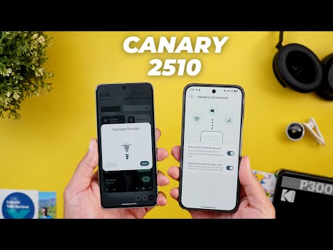
Plus, the app icon itself is no longer shaded, but you can see it in full colors as well. So, that's it with the home screen. Now let's talk about the notification shade and the quick settings. And we got two new changes from QPR2 beta 3. The first one is the redesigned notification history. Each item is now surrounded with its own container as you see here. And the second change is the redesigned data saver icon. On top of this, Android Canary adds one exclusive feature to the flashlight. Now when you tap on hold, you will see a redesigned flashlight strength slider. In the previous builds of Android Canary, we used to have a normal horizontal slider, but now it's inspired by iOS. It looks very similar.
And by the way, when you move it up or down, you get a haptic feedback similar to the one you get with the volume slider. And also, when you push it all the way up or down, you get the same haptic feedback as well. You will also notice that the button in the flashlight icon moves based on the state. When you turn off the flashlight, it goes down. And when you turn it on, it goes up. I do really like the attention to details here, but the only difference between this one and iOS is you don't have the ability to adjust the beam width. Now, it's time to talk about all the new changes under settings. But first, let me show you my latest wallpaper pack that I added to the wallpapers by In-Depth Reviews app. As you see, all of them look great, and I carefully choose them to match your taste. Plus, you have the ability to download any of these wallpapers locally on device. So, you can apply Android 16 wallpaper effects on them without a problem. You will find Google Play Store download link in the description if you want to give it a try.
And now, let's get back to Android Canary. Back to the settings. And the first change we got is exclusive to the Android Canary build. And this one is located under network and the internet and then adaptive connectivity. The first thing you will see here is a redesigned graphical representation. And now we have two different toggles to turn on or off. The first one is called auto switch to mobile network. And the description says ensures connectivity when Wi-Fi is poor or unavailable. Data charges may apply.
And by the way, we used to have this toggle under that developer options, but now it's available under the normal settings, which is much easier to reach. And the second toggle you get is called optimize network for battery life. And it says automatically selects the best network connection to extend your battery life. So now you have more control over this feature and choose exactly how you want it to work. Under sound and vibration and then vibration and haptics, we got the same incremental sliders of QPR2 beta 3.
Under display and touch, the widgets on lock screen menu is now located under the lock screen page. Same as QPR2 beta 3, but there is a small difference between the two. When you open the same page, now we have an animated tutorial to show you how the feature works instead of using a static image. Another change we got under the lock screen settings is a new toggle called show device controls on top of the use device controls that we used to have before. And this new one is a parent toggle. Once you turn it off, it turns off the other one as well. This new change will give you more flexibility on how the device controls behave on your lock screen. So let me explain the three possible scenarios. The first one is to turn off the show device controls toggle. And in this case when you go to the lock screen and then tap on the device controls it will immediately ask you to unlock the device to see the device controls. And the second scenario is you want to get access to the device controls while having the use device controls activated.
And in this case the unlocking is not required either to view or interact with the devices. In this case no unlocking is required. But the third scenario which is to turn on the show device controls while having the use device controls deactivated. In this case you can only check the device status but once you try to interact with any of them it will immediately ask you to unlock the device.
Back to the settings and then accessibility. Now, when you scroll all the way down, you will see a brand new option called contact Google disability support. And when you tap on it, it will take you to a page where you can contact them by phone, chat, or email. So, these are all the new features I wanted to show you. Now, let's talk about the bug fixes I spotted while filming this video. And there are two fixes related to the media controls. Now when I expand the quick settings, the media controls card is no longer truncated like it does on QPR2 beta 3. As you see here, I have to scroll up to see it in full, which is not the case over here. The second fix is related to the media output switcher. On QPR2, it takes time to load, while on Android Canary, it loads immediately. In contrast, there are two bugs with this build that are worth mentioning.
The first one is under the wallpaper and the style app. When you go to the clock, we no longer have the different clock styles and you are stuck with the default option. And this is the same bug we have in QPR2 beta 3. Another bug with this build, which is the removal of the lock screen shortcuts menu. I couldn't find it here or under settings as well. Now, it's time to talk about my experience with the performance and the stability while filming this video.
I would say this build is so much better when compared to the previous versions of Android Canary. It's almost the same as QPR2 beta 3 which is very stable except for the minor bugs I already mentioned in the bugs chapter. Other than this, I didn't come across any showstopper. So, you can give it a try if you want, but in my opinion, if you want to keep things safe, you better stick with the QPR2 cycle because it's usually more stable than Android Canary. and I'm not sure what's going to happen in the future builds. And if you are curious about the Geekbench score, I got 3,634 in the multi-core and 1753 in the single core, which is pretty much the same as the previous versions.
So, that's pretty much it for today. These are all the new changes in Android Canary 2510. Please let me know in the comments if I missed anything..


