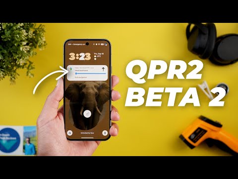
Hello everyone and welcome to the channel. Finally, Google released Android 16 QPR2 beta 2. I will show you all the new features on the Pixel 10 Pro XL. So, without further ado, let's jump in. So, let's start with the lock screen as usual. On the left, I have the Pixel 7A running QPR2 beta 1 and on the right, I have the 10 Pro XL running QPR2 beta 2. And the first change I noticed is related to the lock screen widgets. When you tap and hold to customize the widgets, you will see redesigned buttons at the top. They are smaller than before. And the done button has a new style.
And when you tap on the done button on both, you will see a slightly better animation on beta 2. And here's how they look side by side. As you see, beta 2 takes a little bit more time to do the transition. Plus, it doesn't suffer from the same bug I have in beta 1, which is the unblurred wallpaper. Right after tapping on the done button, you have to swipe one more time to refresh, while the blur effect works on the newer version without a prompt. But unfortunately, I spotted one bug on the lock screen for some reason after this update. When I play a song and then go back to the lock screen, as you see, I don't have the media player, even though I have it activated under settings. So, I'm not sure what's going on here. I tried to toggle the feature on and off many times, but still it doesn't work.
Before jumping to the next chapter, I would like to show you the latest pack added to the wallpapers by in-depth thick reviews app. You can find them under the new featured category. And the reason I called these wallpapers featured because they look amazing on the lock screen with the new live effects feature of Android 16. So all you need to do is go ahead and download the wallpaper locally on device and then you will be able to apply the live effects and let me show you some of the coolest examples. Most of them are designed to work perfectly with the shapes effect. The transition between the lock screen and the home screen looks stunning. Plus, you will find a lot of new options to choose from. So, head over to Google Play Store to get your hands on the app and you'll find the Google Play Store download link in the description. And now, let's get back to QPR2 beta 2. So, that's it with the lock screen.
Now, let's talk about the home screen. And the first change I noticed is how beta 2 forces the unsupported apps to match the themed icons. As you see, they work totally different. Now, those two apps don't support material U. and look at beta 2 and how it styled the icons when compared to beta 1. There is a massive difference between the two. Honestly, I like the previous design better as it matches the colors while this one is a bit darker and looks out of place in my opinion.
So, I prefer if Google can return back to beta 1 design. The second change is the ability to change the home screen icon shapes and you can achieve this by going to the wallpaper and the style app. then scroll down, then go to icons. We no longer have the default manual and the create options as before, but we are back again to the same themed icons toggle. And we have five different shapes to choose from. And here is how they look one by one. To be honest, I don't like any of them and they look childish to me. I prefer if Google can think of something more creative. And the last change in the home screen is how the Google search widget now gets styled when I choose the exact same color palette and wallpaper on both devices.
As you see here, all the app icons are exactly the same and I have the same exact color palette over here. But the Google search widget is picking a different color which is more vibrant. Let me try another one. So, here is a different palette and as you see the color in the Google search widget looks totally different now even though I'm using the same exact color palette on both devices. Now, let me show you the most exciting change in this update which is live activities. I think we got the final version with this update and the only app that I managed to get it up and running with is Google Maps. So, let me show you how they look side by side. When you start the navigation on both devices and then go back to the home screen and then dismiss the picture and picture window, you'll notice here at the top that I have a chip. When I tap on it, this is how the live activities look.
And also, when I go to my lock screen now, I can see it on the lock screen as you see here, which wasn't the case before. I still have the old notification here while now I can see my progress. Also, when the phone switches to the always on display, I still can see my live activities, which is a really nice touch. I also found that the chip at the top left corner will show you the next turn or any update when anything happens in Google Maps. But unfortunately, I'm not going to be able to show you this on camera because it doesn't update. But for example, if you have a turn after 170 m, you can see it right here in the chip, which is something new to this feature as well. And here is a quick example on how the update looks. It says 70 m and then turn left. And as you see, the chip keeps coming on the screen with the new update as well. I also found that when you tap on the chip to expand the live activity banner, it doesn't go away when you tap anywhere on the screen, but you have to tap on it again or it disappears automatically after 3 to 5 seconds like this.
And finally, from this window, you can also exit the navigation immediately. Now, it's time to talk about the notification shade and the quick settings. Starting with the notifications. Now, when you tap and hold on anyone, you will see this new feedback button at the top right corner. Tapping on it doesn't do anything so far, but maybe Google will activate it in the future. When it comes to the quick settings, when you expand both, you will see a bigger gap between the clock and the date, same as the network name and the status bar icons. Other than this, I spotted two bugs in this area. The first one is in the media output switcher. Look at what happens when I tap on it. the animation is broken and also when I expand the quick settings, the media controls are not aligned. Now, it's time to talk about the settings which includes the rest of the new changes. So, let's see what we've got. Starting with network and the internet and then SIMs.
When you tap on add SIM on both, you will see a totally different page design. Everything is now centered and the buttons are bigger. And also, this animation is new. By the way, you will see the same design language in multiple pages under settings, which I'm going to show you later. Plus, when you tap on setup and eim, this new animation is also available in multiple pages when you try to load anything under settings, which looks a lot better. Also, this page for scanning the QR code looks different. Now, you have the ability to switch between the cameras and the scan from photos or photo button is much bigger. Now, then under sound and vibration, for some reason, when I go to ringtone, I lost the new version of the Pixel sounds app of the Pixel 10 Pro XL. And I'm back again to the same old design.
Plus, as you see here, we have a bug says Android resource, which I'm not sure what it means, but when you try to choose a different sound and then go back to ringtone, it will work back again. Another place where you can see an updated loading page similar to the one under the network and the internet. When you go to software updates and then go to the software update page, as you see the loading animation looks different with the same bold font and everything is now centered with a bigger button. And the same applies to the Google Play system update page. It also got the same new design where everything is now centered and a bolder font bigger button. Moving to security and the privacy. Here you will see a lot of design tweaks. The first one is the material 3 expressive redesign which we already got in the past but for some reason it disappeared and now it's back again with QPR2 beta 2. Not only this but when you go inside any of these pages you will see an updated graphical representation that now supports the material U colors.
It adapts based on the colors you choose under your wallpaper and the style app. Another system why the change is when you try to do anything that requires your pin code, the text box got updated and now it has a border around it with a title as well that didn't exist before. And when you go to privacy controls and then go to health connect, you will see a brand new menu here called devices and it says manage your connected devices which didn't exist before. When you go inside, you can choose your current device to count the steps and save this data to health connect, not only from your watch. And here you can see the rest of devices you can add to the list if you want. Back to the main security and the privacy page.
When you go to private space, you will see a redesigned wizard with bigger buttons. But unfortunately, all the buttons are in blue color even though we have the material you support in the previous version. So, I'm not sure what's going on here. Plus, we got the new loading page I already showed you in other places. And when you continue with the wizard, you will see more bigger buttons. As you see here, we have much bigger skip and next buttons. And the same applies to the rest of the wizard. As you see, everything is now bigger. So, that's it with the security and the privacy. Now, let's go to passwords, pass keys, and accounts. When you go to your current autofill account and then go to preferences, you will see one more toggle that didn't exist before called verify before filling passwords. One more change I spotted only on the Pixel 10, which is the new device health and support menu. I already got this menu on the stable version, but when I go to it now after updating to QPR2 beta 2, I see some differences.
As you see, it will do all the checks and then tell you the status. But when you scroll down, I think those two options are new to QPR2 beta 2. And when you go to charging diagnostics, it will download something when you use it for the first time and then take you through a wizard to check if you have any charging issues. It will do all the needed checks automatically and then tell you that everything is okay and giving you some suggestions to do later. And once you are done with the wizard, it will ask you either even more questions, try another charger and so on and so forth. So this is how it works and you can exit at any time. You have the same thing for the touch. And here how you can use it as well. So now it's time to talk about my experience with this build while filming the video. When it comes to performance, it's okay. The phone is still responsive. No issues. But when it comes to the UI, there are a lot of glitches and visual issues that I came across while filming the video and I showed you some of them in the previous chapters.
So if you don't want to see these visual issues, it's definitely not recommended to install this build. Plus, it doesn't add anything major to take the risk. And when it comes to Geekbench score, I got 6,145 in the multi-core and 2289 in the single core. When you compare this to the previous results, they are about the same. No major difference here as well. So, that's pretty much it for today. These are all the new features you need to know about Android 16 QPR2 beta 2.
Please let me know in the comments if I missed anything. But for now, thanks so much for watching and see you in the next.