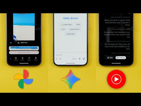
This is Google Apps updates roundup number 119. In this episode, I will show you more than 37 new features in seven different Google apps. So, make sure all your apps are up to date and let me show you what's new. Let's start the episode by talking about the YouTube app, which you got a complete revamp. When you open the app, you will immediately notice how all the icons and text look different. So when you take a look here at the top, you will see that all these icons are now bolder than before.
Same as the explore icon and also the icons we have in the navigation bar at the bottom. And when I tap on the search, you will see the same behavior. A brand new microphone icon. The search icon on the left is now bigger and bolder, same as this arrow. And when I open any of the videos, you will see a revamped player as well. The buttons are different with more rounded icons. And here we have a much bigger full screen button. Same as the pills for the chapters and the time here are bigger as well. And when you take a look here at the carousel we have under the video, it's also using totally different icons, especially the thumbs up and thumbs down.
They look totally different now. And when I double tap on the screen to seek forward or backward, you will see the plus and minus 10 are now using a different font with a brand new animation. And the description got some tweaks as well. The first thing you will notice here is the smaller description and title font. All the boxes around these stats and the description are now darker which makes it easier to read. Then we have the how this content was made and the AI summary swapped places. And when you scroll all the way down the carousel at the bottom now includes all the social media links while previously we used to only have videos and about.
The suggested video overlay also got some visual tweaks. First the thumbnail is now bigger. the channel name pushed to the bottom instead of showing directly under the video title. And the two buttons you see over here are now smaller. The mini player buttons also got updated as you see here, they are bigger and darker than before. And when you play a short like this one, for example, all the icons on the right got updated as well to match the new design language. Plus, when you go to the channel itself and play any short, you will see this new overlay to quickly add a comment or one of these emojis. Plus, the AI summary box that you might see while scrolling in your home feed also got some design tweaks. First, the disclaimer is now different. It says quality and accuracy may vary. Instead of saying summaries are experimental, and the send feedback button got replaced with thumbs up and thumbs down. Google also updated the web-based YouTube. Now you get animated background matching the thumbnail colors when you hover the mouse over the video.
All the icons got updated as well. Same as the YouTube app. Moving to the player, all the buttons are now surrounded with containers. We got new icons, new animations, and some of these buttons show the equivalent keyboard shortcut when you hover your mouse over them. in the full screen view. Now you get access to the thumbs up, thumbs down, comments, and share buttons, and they are all grouped together in one container. So that's it with the new YouTube design. Now let's talk about YouTube music. And here I'm going to show you seven new changes. Starting with the design, you will see the same thing as the normal YouTube app. All the icons are now bolder and more rounded. When you take a look here at the bottom navigation bar, you will see a brand new icon for the library that looks like the bookmarks icon. The liked music thumbnail got updated as well with a brand new thumbs up icon and a different background color. Moving to the search, you will see the same icons used in the normal YouTube app are also used over here.
Moving to the now playing screen, the media buttons are now a lot bigger with more rounded icons. Same as the carousel at the bottom. Also, when you take a look here at the pin icon, it's now angled, not straight like what it used to be in the previous version. And also this new category which called fresh finds. Old favorites used to be called forgotten favorites. But it's not only about visuals. We got some functional changes as well. Starting with the lyrics. Now you have the ability to translate the lyrics in your own language. And at the bottom you'll see the translate button next to share. Tapping on it will change into translated. And it will show you the two languages side by side. And here is how it animates when you switch between them. The second new feature we got can be found in the home feed. When you scroll down a bit, you will see this banner saying match your music taste with friends plus get a playlist. Tapping on it will allow you to create a collaborative playlist and invite people to join.
And then you can collaborate together. And when you tap on invite, it will create the link and show you the share sheet to start inviting new people. Another way to access the same feature is by going to library and then tap on the new button. And here you will see a new option called taste match which will take you to the same exact floating cart. Last but not least, a long time ago we got a brand new feature called badges.
But back then I've never seen anything listed under this page. While recently I started to see some badges added to the list. And one of them says that you were in the top 1% of their audience of 24 million in August 2025. When you tap on the badge, it will expand the menu at the bottom or by tapping on the ellipses as well. From here, you can share your badge as an image using thirdparty apps, quick share, or save it to your library. In addition to the ability to go to the artist page or delete it if you want. I saved one of the badges to my library and here is how it looks. Next, Google Photos. And here I'm going to show you three new changes. The first change is the new squiggly progress bar that you will see while the app is loading the photos and videos. So, for example, when I try to edit this video, you will see that the progress bar is a new squiggly line that has the same animation we have in the media player.
And the second change is a big one. Now, you have the ability to add music to any video you have by scrolling all the way to the left and you will see the new music option over here. Tapping on it expands a floating card with plenty of options to choose from. Plus, you have some filters at the top. You have bright, chill, dramatic, funky, inspiring, romantic, and sad. So, for example, if you want to choose one of these songs, when you tap on it, it will give you a play and pause button.
So, you can listen to the soundtrack like this. And once you are happy with the choice, you can tap on select. Then, it will immediately take you to a page where you can choose which part of the sound track you want to add to the video. Once you are happy with the choice, tap on the tick button. Now you have two layers, one for the video and one for the soundtrack. When you tap on the soundtrack layer, from here you can adjust the section one more time or you can adjust the volume. You have a slider for the video and another slider for the soundtrack, which is a really nice touch. And then we have the option to change the soundtrack from here as well.
And finally, you can remove the track by tapping on this button. Last but not least, the search page also got updated and now we have this new carousel at the top that will give you quick access to some of the people and pets you have in your library. And when you tap on the ellipses, it will take you to the full page. Before jumping to the next chapter, if you like any of the wallpapers you see in this video, let me show you the latest wallpaper pack I added to the wallpapers by in-depth thick reviews app. I added 22 new stunning wallpapers to the list that you can enjoy right now. If you want to download the app, you will find the Google Play Store download link in the description. And now, let's get back to Google Apps updates. The next app we have is Google Maps. And here I'm going to show you seven new changes. The first change is under the U tab. Google added a brand new section here called your recent visits.
And the description says from your maps history and saves. From here, you can check all the places you recently visited and you can tap on see all to expand the list. From here, you have some quick shortcuts like the ability to add any place to your favorites or any other list you want. Then you can tap on the ellipses to share the place directly from here. See visits and maps history. And this one takes you to your timeline. And then we have the ability to delete from maps history. At the top you have the ability to search for a specific place you visited. You can filter using the area, the category, and here you have multiple stuff to choose from. Saved. You can choose only to show the places you saved. And then you have the maps history. From here, you can also access Google Maps settings if you want. It's also worth noting that this list supports multi selection.
You can just tap on hold and select multiple items. And at the bottom, it will give you the option to do bulk share or save. or you can select all of them as well using this button at the top right corner. The second change under the U tab is the redesigned new list button. It's now smaller. It has a fill color and appears next to the sections header. And the last change under this tab is the removal of the following button from the bottom of the screen and I couldn't find any alternative to this option in the new version.
Under the search, we got a small visual tweak. Now the microphone icon is using Google colors to match Google Lens unlike the black color of the previous version. I also started to see a new visit site button when I use the global filters in Google Maps. As you see, this new banner has a visit site button that only appears under the sponsored listing. So none of these places show the same banner except the first sponsored option. And the same applies to restaurants. I have it over here but not in other places. Under the directions page, we also got one new change. If the app thinks that there's another good option to reach the place, you might see it as a suggestion. In my case, it says also consider walking. And in other cases, it might suggest public transportation. On Android Auto, we also got a couple of new changes. The first one is the reappearance of the incident report button, especially for those who are using smaller Android Auto displays.
And the second the change now when you tap on the search bar you no longer see the suggested location section and now it's hidden by default. The next app we have is Gmail. And here I'm going to show you three new changes. The first change is in the messages list. Now you will see a small dot next to messages instead of only using the bold font like before and that makes it more obvious in my opinion.
The second change is the new purchases view that you can access from the side menu. It's located over here under important. This one consolidates all the email messages related to your orders. And in some cases, you might see a summary at the top which includes the ones that need your attention. But I don't have this section right now. And in other cases, when you open any of these messages, you might see a banner at the top that includes some of the information you might need, like the order number or the tracking website. Last but not least, I used to have a suggestions section at the bottom of the screen that includes multiple fully written emails using AI as per the screenshot you see now on the screen.
But for some reason, I'm back again to the same short suggestions as before. Next, Gemini. And here I'm going to show you six new changes. The first change is related to web pages. When you open any web page, like an article for example, and then trigger Gemini, now you will see a new chip to summarize the page. Tapping on it will immediately summarize the page for you instead of using a voice command like before which is a really nice touch. And here is how it works. It will take its time and then expand the summary in this floating card on the screen. The second change is in the app itself. In one of my previous episodes, I showed you this new borderless text box, but Google updated it one more time by adding the model switcher to the same box instead of having it at the top.
And that makes it a lot easier to reach. When it comes to Gemini Live, we got two new changes. The first one is the redesigned Gemini chip in the status bar when you use the screen sharing. Instead of only showing the screen sharing icon with the counter next to it, now it shows the Gemini icon with the screen sharing icon in the same container without the time that you can only see now by revealing the banner. The second Gemini live change is the availability of the new visual guidance feature to all Android phones including free accounts which was only exclusive to the Pixel 10 models previously. So let me show you how this feature can help you by using one of my free accounts. Which one is the Nest Home Mini? The Nest Home. As you saw, this visual guidance feature will highlight things on the screen to make it easier for you to follow along.
Change number five is the full screen profile menu to match all other apps that support the material 3 expressive design language. Google also removed some of the extensions we used to have under the apps page like YouTube, Google Maps, Google flights, and hotels. The functionality remains the same, but instead of activating certain toggles or reference these extensions in your commands, Gemini will understand you directly. And the same applies to the web-based version on your PC. Next, Gboard. And here I'm going to show you two new changes. The first one is the smaller font. After installing QPR2 beta 3, I found that my keyboard has a smaller font than usual, even though I didn't change anything in the settings. But I'm not sure if this change also applies to the stable version or not. But as you see here, the letters and everything looks noticeably smaller than before. The second change is under settings and then preferences. Now you have the ability to turn off the comma and period keys using these toggles. And when you do so, and then go to the keyboard, as you see, the space bar is now a lot wider.
As a pro tip, if you like this look, you can still add a period quickly by doubletapping on the space bar like this. And if you want to access the comma, you need to go to the numbers keyboard, which will also give you access to the period. So, that's pretty much it for today. These are all the new changes I wanted to show you in Google Apps. You can reach me out on social media if you spotted any new feature that you want me to include in my future episodes. But for now, thanks so much for watching and see you in the next.


