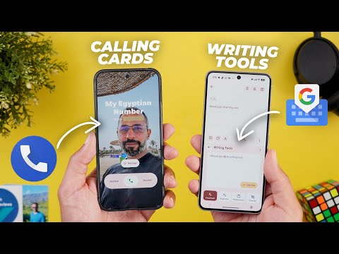
This is Google Apps updates roundup number 115. In this episode, I will show you more than 40 new exciting features and the changes in 18 different Google apps. So, make sure all your apps are up to date and let me show you what's new. Let's start the episode with Gboard that got some new exciting features. The first change is the new writing tools to match what Apple and Samsung did. And I'm really happy to see this feature showing in my favorite keyboard. To access the new writing tools, there are multiple ways.
Either while typing, it gets automatically populated here in the suggestions bar. As you see here, it's a pin with the AI stars. Tapping on it will automatically open the writing tools. As you see here, I have some spelling mistakes. And the first option I have at the bottom is proofread. And it's showing me here what I need to correct. Gboard got a new feature called writing tools. So, it corrected all my spelling mistakes. If I want to use this text, I can just tap on this button like this and it will update the text for me. And if I want to access the writing tools later, if it if it's not populated in the suggestions bar, I just need to go to the tool box and then tap on this button. And I'm back again to the same screen. Here I have multiple options to choose from. I have rephrase and this one gives you multiple options.
Then we have professional. Then we have friendly and emojify. Then we have elaborate. And finally we have the shorten option. The best part about this feature is you can use it anywhere throughout the OS and it works really really well. Plus you have here an ellipses if you want to report any generated content. And in some cases when you select text the writing tools button might animate in the suggestions strip as shown now on the screen and in other cases it might only suggest to proofread your text.
The second change is the autofill integration. When you look closely here you will see a new button that looks like a sheet of paper with an asterisk and a pen. Tapping on it gives you access to your passwords and payment methods. From here you can get access to this information even if Gboard didn't automatically suggest your details. Also when you activate this feature for the first time you get this banner asking you to turn on the feature.
When you tap on turn on it takes you to the onscreen keyboard settings to turn on the autofill toggle and also choose which autofill service you want to use. And the last change is related to the assistant voice typing. When you switch to the floating bar and then tap on the language button. Now you will see a new option called show symbols keyboard that will show a floating window with all the symbols and numbers that you can use while using your voice.
And once you stop typing it will automatically revert back to the voice typing as shown now on the screen. Plus you can place this window anywhere you want by using this handle and close it using the X at the top left corner. And when you tap on the microphone, it will start and stop the assistant voice typing. Now, this chapter is done. But have you ever wondered how I keep track of all the new features and the changes I share with you? The answer is simple. I make things as organized as possible. I personally started to use a new tool called AIFlow that made my life a lot easier. Seriously, I didn't even know something like this existed. So, here's how AIFlow helps me stay productive and organized. First, I go to my inbox and list all the tasks I want to achieve. This step alone free up my mind and help me keep track of my progress.
Plus, under the profile menu, then integrations, I can connect my Google or Outlook calendars in addition to 32 other services like Gmail, Outlook email, notion, Slack, and many more as shown now on the screen. By this, I have all my information consolidated into one place instead of jumping back and forth between tools. I personally use Gmail and Google calendar. So I connected them to Akilow and by this my calendar is on the right and the tasks I added earlier are on the left.
Now I can use the time blocking technique by dragging and dropping the tasks to my calendar and assign a time block for each one. Additionally, when I check my emails and mark certain messages as important, they automatically appear in my tasks inbox so I can also assign time blocks for them. Now I'm on top of everything and know exactly what I need to finish and when by just looking at one screen.
Another cool feature in AIFlow is the AI chat. You can use it to edit or reschedule your tasks and calendar events or automate certain actions like checking the weather or exchange rate and let the tool notify you when needed. All by using natural language as if you are talking to chat GPT. If you want to try AIFlow right now, use the link in the description or the pinned comment. And now let's get back to the video. The next app we have is Gemini. And here I'm going to show you five new changes. The first change is related to the trigger animation. When you press and hold on the power button, as you see, the glow colors are matching Google colors. The text box itself is now more rounded.
And I do love the way it animates. It's very bouncy and looks great. The second change is in the app. Google updated the side menu. First, it got a new icon. Instead of the text bubble, it's now using the hamburger icon. And when you tap on it now, you can do multiple things. First, you can search your chats. And this is how it looks. You can also pin any of the gems you want in this area. So, if you want to pin or unpin, just tap and hold on the gem and you can remove pin or add it the same way.
And when you go to the explore pins page, you can pin any of these gems to your side menu by tapping and holding on it. Plus, if you want to take a look at your chats, you have endless scrolling. The third change is related to Gemini Live. Now, it integrates with more Google apps which will allow you to take actions in these apps. So, let me show you a couple of examples. Here I have my to-do list in a piece of paper and I will ask Gemini to save it to keep notes. So I will switch the camera. Can you save this list in Keepotes? I've saved the list to keepotes for you. It includes nine items. Google apps EP100. As you saw, it showed Google Keep integration at the bottom of the screen.
And now when I go to keep notes, I have it immediately saved for me, which is a very, very handy feature. It also integrates with Google Calendar. And here is a piece of paper with the date and time. So I will ask it to create an event for me. Can you create an event? Sure. I can help you create an event for August 28th, 2025 at 5 p.m.
What should I title this event? Important meeting. I've created an event called important meeting for you on Thursday, August 28th, 2025 from 5. So when I go to my calendar on the 28th, you will see here the event created. It also works with Google tasks and maps and expected to support Google phone and messages, but I didn't get this integration just yet. Change number four is related to the widget. You will notice here it got a slightly different design. The top corners are now more rounded to be in line with the text box while the bottom corners are more squared off to match the buttons. And when you make it smaller, you will see the same thing. The side next to the Ask Gemini button is more rounded than the other side. Also, you'll note here that the Ask Gemini text box now uses a different color, while the previous widget used to have one color for everything.
And lastly, once I connected my PixelBuds to the phone, I got this page popping on the screen giving me two options. The first one is called only require one unlock. After your ear pods connect to an unlocked device, you can talk to Gemini without unlocking again. Resets if you remove your ear pods. And the second one allows me to let Gemini read my messages. Next, the phone app.
And here I'm going to show you four new changes. The most exciting change in the phone app is the new calling card feature. When you first get it on your phone, you will see this banner explaining how it works. It says, "Introducing calling card. customize how you see your contact when they call you. And now let's take a look at it into action. So let's say you want to create a calling card to one of your contacts. Just tap on it to open. And you might see this banner if this is the first time to use the feature.
Or you can tap on the edit button. And in this case, you will see two uh placeholders here. One for the profile picture and one for the calling card. When you tap on the plus button, you have the option to use the camera, use the gallery, or open Google Photos, which will give you full access to all your photos and videos and the ones synchronized to the cloud. So, let's say I will pick this photo as an example. Here I can pinch to zoom and I can also change the font. I have plenty of options to choose from. And then I can give a color to the font. Here I have multiple colors as well. So, I think the white color looks the best. And once you tap on done, it will ask you if you want to use the same photo for your profile picture or not. So, I will confirm and crop.
And now I have everything saved. So, let me call myself and show you how it looks. As you see, it animates nicely. It shows the photo in full screen view and it definitely looks so much better when compared to the previous screen. Your contact page will also look so much better after adding a calling card. And later down the road, if you want to remove it, just tap on edit and then you have the option to remove at the bottom right corner. Also, keep in mind that this feature doesn't support videos. You can only set photos. We also got a couple of new changes related to the history. When you expand any of your recents, now you can see additional interactions with this contact on top of the most recent one. And it says here in a small text, see more in history if you want to check the full list. Plus, now we have three shortcut buttons to call, video call, or message this contact from here. And lastly, when you go to the contacts page, you will notice here that each category and later are now separated.
The next app we have is Pixel Studio. And here I'm going to show you two new changes. If you may know, the Pixel Studio is exclusive to the Pixel 9 models. And now Google is using it in a sort of the markup app to edit your screenshots. And it gives you plenty of new options. To show you how it works, now I will take a screenshot on my Pixel 9 Pro XL. And when I tap on edit, I'm getting a totally different page. At the top, we have the delete, undo, redo, share, and save buttons. At the bottom, we have a floating bar that includes all the tabs. The first one is the crop which got the more rounded handles here at the corners. And then we have the brush which will allow you to adjust the thickness and also change the color.
And as you see, you get this new animation when you tap on any of the colors. The same applies to the highlighter. And finally, we have the eraser. Once you finish this tab and then go to text, you will see plenty of new fonts to choose from. They are a lot when compared to the markup app with the ability to change the color here as well. And then we have the magic wand tab, which will allow you to use AI to do certain actions. Here you can do a manual selection which will allow you to select whatever you want like this.
Or you can rely on the quick select option that uses AI to select certain parts of your screenshot. Then you can modify your selection later by using the expand or deselect if you want. Then we have the ability to invert the selection and a text box to use AI to edit the screenshot. So let's say I want to add a cat to my screenshot. So let's see what's going to happen. At the bottom you will see the progress with material UU animations at the bottom and once done you will see the results and then you can give feedback using the thumbs up and thumbs down or you can regenerate something else.
Once you're happy with the results, you can tap on the text sign. Then we have the stickers option which will allow you to add stickers from your Pixel Studio app or generate new ones. And lastly, we have something similar to the magic eraser, which will allow you to erase stuff from your screenshot and use generative AI to fill the background.
Then tap on erase and let's see what's going to happen. So I want to remove all the icons from my home screen. So let's see how it will achieve this. Let's remove this part as well. So, it works pretty much the same as the magic eraser, but for your screenshots. Not only this, but now you can get access to Pixel Studio from your Google photos. So, for example, when I open this screenshot and then tap on edit, go to the more tab. Now I have the Pixel Studio option instead of the markup, which will take me right away to the same page.
Next, we have Google Calendar that got the Material 3 expressive redesign. The first change is the material 3 expressive redesign. When you open the app, you'll notice here that the font is bolder. The current day is highlighted with a pill. And when you expand the filters at the top, you see the currently selected month highlighted with a pill while the rest of the options are rounded rectangles. Also, when you take a look here at the widget, you will see the plus button is smaller and has a pill design instead of the rounded squares like before. And here's the difference between the two. Also, the arrows at the top are smaller to give more space for the days. And the same applies to the calendar app on where OS. When you open the calendar tile, you see much bigger font and the calendar button is now in line with the watch shape.
Tapping on it will reveal the app and then you will see bigger buttons which makes it easier to interact with the app. The next app we have is Gmail and here I'm going to show you five new changes. After the first iteration of Material 3 Expressive, Google pushed further design tweaks to the app and the first one you will see is in the main page. When you take a look at the top bar, you will notice that the hamburger menu and the profile menu are now separated. The search bar is thicker and the Gemini button is inside the search container instead of showing on the far right. To me, this new design looks so much better. And also, when you tap on the search, it got a nicer animation in comparison.
Another minor tweak I noticed is when you tap on the search bar, you no longer see the compose button like before. And when you search for something, you will see a material U progress bar. When you go inside the message, you will see further design tweaks. The reply, forward, and emoji buttons now have a fill color. The automatically generated replies are now labeled under a new section called suggestions, and it has a glyph icon that looks like an arrow with the AI star on top of it. Also, when you reply to the message, you will see the same section labeled unlike before. Last but not least, now you can mark your email messages as read from the notifications shade, which is a very nice feature. The next app we have is Google Chrome and here I'm going to show you five new changes. The first change is related to the tab groups.
If you have any web page open and then go to the overflow menu, you will see a new option called add to tab group. When you click on it, it will show you an overlay card at the bottom of the screen with the currently available groups or you can create a new one immediately from here. Then give it a name and color and it will be automatically created. You can achieve the same thing by tapping and holding on the taps button and you will see it as the last option over here. The rest of the changes are related to the password manager. So when you go to settings and then it choose Google password manager, you will see a redesigned page that supports material 3 expressive. Here you have the search bar, the profile menu and the app icon.
When you tap on the search, as you see, it got a new animation. Here at the top you have some filters. You can filter by passwords, pass keys, and network devices. On top of this, the add password button got a material U shape around the icon. And when you go to the app settings, you will see a brand new option here called automatically create a pass key to sign in faster. The description says allow sites and apps to upgrade existing accounts to use pass keys. Last but not least, if you don't want to use the Google Password Manager through Google Chrome, now you can download it as a standalone app from the Google Play Store.
And here is the app listing. When you install it, it will take you to the same exact page. No difference, but instead of opening Google Chrome first, you will see the app icon on your home screen. And this is how it looks. The next app we have is Keep Notes. And here I'm going to show you two new changes beside the Material 3 expressive redesign. I already covered in one of my previous videos. We got further tweaks in the app with the latest update. The first one is the new sort button inside the search bar. Tapping on it reveals a card at the bottom of the screen to sort your notes by date created, date modified or custom. When you choose any of the other options, the icon changes and gets um fill color around it and one of the arrows becomes highlighted. And this is the same for the date modified. Once you get back to custom, the icon gets back to normal. And I think Google added more backgrounds under the styling menu that I've never seen before.
So, let me go through the whole collection to show you what you get. Next, we have Google app. And here I'm going to show you two new changes. The first change is under that discover feed. Now, when you scroll down and then scroll back up, you will see a new arrow at the bottom right corner that takes you back to the top of the page. And when you open the app and then try to play any of the suggested YouTube videos, you will see this button at the top right corner saying YouTube with an arrow pointing towards the top right corner indicating that this button will take you to the relevant app.
But this is not the case when you do the same from your home screen. Now, let's talk about the calculator app that got the Material 3 expressive redesign. And this is how it looks. First, Google is using a totally different font as shown now on the screen. We no longer see some of the expressions in this area, but everything is now hidden under this menu. Plus, the expand arrow looks different as well. We no longer have a handle here in the middle to reveal the history, but it got replaced with a button at the top left corner. But you still can use the swipe down gesture to access your history. Also, the overlay menu looks different now and each item has its own icon. Plus, the history button got replaced with clear history. So, previously the history button just swipes down like this, but now you have the option to clear your history if you want. It's also worth mentioning that the digits no longer change their shape when you tap on them like before, but they remain circular. By the way, if you like any of the wallpapers you see in this video, they are now available in the wallpapers by in-depth thick reviews app.
And here are the latest additions. Plus, now you have the ability to download these wallpapers locally on device to apply the Android 16 wallpaper effects on them. So, you'll find Google Play Store download link in the description. And now, let's get back to Google Apps. Next, Google Photos. And here, I'm going to show you two new changes. The first change is the ability to edit your memories in Cap Cut. For example, when I open this one, now I see a button called edit in Cap Cut. Tapping on it will first allow me to select the photos and videos I want to migrate and then once you are happy with the selection, tap on edit in Cap Cut. It will create a new project for you. So, let's give it some time to see how it works.
Now, it's done. And here you will see your photos and videos ordered exactly the same way as your memory. Here you can apply further edits in cap cut and save your progress or export. And here is a new project created for me. So I can get back to it at any time. Duplicate, delete, rename, etc. The second change is also related to memories. Now, when you try to share it and then go to the photos option, now we have a button to select all the photos and videos included in the memory, which wasn't the case before.
Now, let's end this video by talking about the apps that only got one new change. Starting with YouTube. Now, when you go to your app settings and then scroll down to quality, you will see a new section for the audio quality, not only video like before. Here you can choose between auto, higher audio quality or normal. Moving to the Fitbit app. Now it supports dark theme which is something you can activate under your profile menu then Fitbit settings. Now we have a new option called theme which will allow you to choose between system default light or dark. So let me show you how the dark theme looks. As you see it looks pretty good and I really like how the colors contrast with each other.
In Google Messages, we got one minor visual tweak. Now, when you take a look at the top header, you will see that Google Messages is written in full text. On where OS, Google Maps got the material 3 expressive redesign. Starting with the tile here, you will see more colors and different shapes for the buttons. Same as the search button that matches the watch shape. And when you open the app itself, let's say I want to tap on this button here, you'll see the same thing. The buttons are bigger, more colorful, and everything looks more pleasing. Google Tasks on Android also started to see some of the material free expressive design tweaks. And the only changed part is when you tap on any of the tasks. Now you see a container to separate the task from the rest of the page. And the mark completed button got a fill color and a pillshape design. And lastly, Google Wallet. When you add any pass to the app, it will automatically show up on your watch without you doing anything, which is a very handy feature.
Also, when you receive any pass on your Gmail, it will be automatically added to your Google wallet. So, that's pretty much it for today. These are all the new changes I wanted to show you in Google Apps. And if you spotted any new feature that I didn't mention, please reach me out on social media so I can include in my future episodes. But for now, thanks so much for watching and see you in the next.


