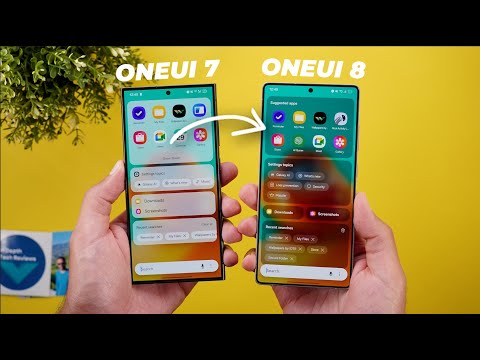
Hello everyone and welcome to the channel and 1 UI8 beta 1 is officially available and I have it here on my S25 Ultra. Of course, I'm not in one of the countries that have access to the beta through Samsung members app. So, I had to install it in a different way and today I will show you everything you need to know about 1 UI8. So, without further ado, let's jump in. Let's start with the lock screen as usual. On the left I have the S24 Ultra running 1 UI7 and on the right I have the S25 Ultra running 1 UI8. And the first change you will see here is the widgets are now bigger even though the number of available slots is exactly the same but in 1 UI8 they are bigger and easier to read.
And the now bar got two new changes. The first one is when you tap on it like this to expand. Now you get a haptic feedback that didn't exist before. The second change when you make a call or join a meeting now you can see it in the now bar. And by tapping on the chip you get immediate access to the relevant app. Even though I'm running the same exact Google Meet call on both devices, but only the S25 Ultra is giving me this option. Now, let's move on to the lock screen editing page to show you even more changes. The first one is the new clock style. All the styles are exactly the same except for one new style added to the list, which is this one.
It looks very similar to the one I currently have on my S24 Ultra, but slightly different. Moving to the widgets, you will only see one minor change. When you expand the camera widgets, you will see that they got an updated preview, but they work exactly the same. And we also got one new shortcut for the lock screen. When you expand both, you will notice here that now we have a new create note shortcut. And when I set this one and try to access it, it will open Samsung Notes in a floating window so I can start writing my note. Moving to the wallpapers, there are a couple of new changes. When you scroll down to the colors category, you will see two new dynamic wallpapers that didn't exist before and they have a tag at the bottom right corner.
So, for example, when I choose this one, I have a style button instead of a color button. And here I have different styles to choose from. And as you see, the wallpaper animates on the lock screen. So, for example, when I tap on done, it will change its colors. As you see here, it's purple and then we have a green spot. And when I lock the phone and unlock it, it will animate like this. And you can choose between four different styles. The second change is under the photo ambient mode. You notice here that it got a new preview wallpaper of a dog instead of using this landscape. So, let's try both and see which one looks better. So let me play the animation at the same time to see the difference for me. Both look almost identical. So that's it when it comes to the lock screen. Now let's talk about the home screen. And the first thing you will immediately notice is how bigger are the widgets. I'm using the exact same ones on both, but you'll see here that the weather widget is bolder and bigger.
Same as the Google app widget. And when I go to the other page, I have some examples to show you the difference. Seems like Samsung is making everything bigger and bolder and minimizing the spacing between the items to give the icons more real estate. Not only this, but when you tap and hold on a widget, it gets briefly highlighted as you see over here. And for this weather widget specifically, when you go to settings, you will see more options related to the font color that didn't exist before. Now you can choose between white, black, or auto. Plus, Samsung did follow the same behavior under the widgets picker as well. And you will see that the widgets are now pushed to the sides to be bigger and minimize the white space. And in other scenarios like the clock widgets, you might see some widgets side by side to give more space for the rest of the items. So that's it when it comes to the home screen, but let me show you the complete revamp of the systemwide search. The most notable change is the more transparent background so you can clearly see what's underneath it.
And by the way, you will see the same design change everywhere throughout the OS. And I will show you more examples later, but you will see even more differences on how things are organized on the screen. For example, the suggested apps is now getting a title and you no longer have the show more or show show fewer button, but everything is already expanded. Then Samsung is no longer using this horizontal scrolling having some stuff hidden. But now you can clearly see everything on the screen. The downloads and screenshots list are now two separate chips that you can tap on. And here you have another carousel, which is no longer the case.
And the clear all button has been replaced with an icon. And when I search for something like the word photo, for example, you will see even more differences. First, any show more button that you see here is now gone and has been replaced with a drop-own arrow. And this is a very nice touch because when you expand or collapse a list, you can immediately do it like this. But previously, if I expanded this list, I have to scroll all the way down to be able to show fewer, which is not very convenient. The second change is the search in app button has been replaced with an arrow. So every time you see this arrow next to the app name, when you tap on it, it will do the search inside the relevant app.
That's exactly the same feature, but things are now better organized. And when you scroll all the way down, the search bar is now called show more. And the search bar has a more solid background when compared to one UI sub. So that's it when it comes to the search. Now, let's talk about the quick settings. And by the way, I couldn't spot any difference in the notifications, but I will show you a couple of visual tweaks in this area. The first thing you will notice here is the slightly bigger tiles and less spacing between the items. And when I expand both, the difference will be more visible. And the second change is a very minor visual tweak. When you go to the editing page, you will see a new gear icon next to the panel settings. Other than this, everything is exactly the same. Before jumping to the next chapter, if you like any of the wallpapers you see in this video, they are now available in the wallpapers by in-depth thick reviews app that you will find its Google Play Store download link in the description.
And now let's get back to the new features. Now let's talk about the new sharing features and let's say I want to share multiple photos. You will see a redesigned share sheet. First, it has a more transparent background similar to what we have seen in search. And as I mentioned before, you will see this new design language everywhere throughout the OS.
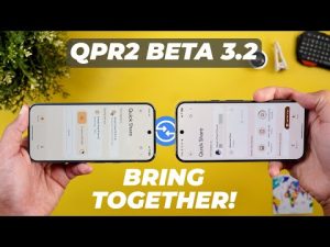
Plus, the share sheet itself is much bigger. It has a floating design instead of stretching from edge to edge. And you will also get more rounded corners. And we got a new secure folder tab that will allow you to share these items with the apps you have in your secure folder. Even though I have the feature activated on both devices, but only 1 UI8 is giving me this tab. This will take us to the new changes we got in quick share.
The first one is a new banner at the top that will show you the count of items and total megabytes you are about to share. Plus, we have two tabs at the bottom. One dedicated for the send and another one for receive. And the description says anyone nearby can share with you while you are on this screen. Which means if your quick share visibility is set to contacts only or no one, you don't need to worry about changing it under settings, but simply open this screen to be temporarily available for everyone. And once you're done, your settings are back to normal. And if you want to trigger the same screen without the need to use the share sheet, you can simply tap on the quick share tile and it will take you to the same exact page.
And here is how the empty send tab looks. Now let's move on to the new multitasking features and the first one is related to the split screen on 1 UI8. Now I have the ability to split the apps in 90 to10 ratio. So for example I can make the other app too small like this. But previously the smallest ratio you can get is 70 to 30 but now it's 90 to 10. Plus we got one more gesture which is the ability to switch between apps quickly like this. And this is one of the features that we will get on Pixel UI as well with Android 16. The second change in multitasking is the redesigned pop-up view window. In 1 UI8, we no longer have this white frame around the app, which will give you more real estate. The minimize button that looks like two arrows is now a dash or an underscore. And the ellipses are now located on the left side instead of the right side next to the X. Next, the predictive back gesture. This feature is already available on 1 UI7 and you might see it in some apps like YouTube music for example.
But with 1 UI8, I started to see it in more places. For example, when you open the phone app on both the predictive back gesture only works on 1 UI 8 and the same applies to the settings. when I open a page and then try to go back. You see here that it works and it gives me a really really nice haptic feedback that doesn't exist on One UI 7. And now it's time to talk about the new changes under settings. The first one is under connections and then Bluetooth. When you tap on the ellipses to access the OraCast feature, you will see a redesigned page with an animation at the top.
And when you tap on it, it will stop the animation. We have a much bigger broadcast button. And when you tap on it on the newer version, you will get this screen with the password and the ability to share your OraCast details via QR code. And you have a much bigger stop broadcast button. And if you have a supported low energy Bluetooth headphones, you can also join other broadcasts using a QR code. Moving to connected devices and then Samsung Dex, you will see a much simpler settings page. You have two options, one for the wired connection and one for the wireless. But unfortunately, Samsung Dex didn't work for me to show you the new changes. But I will try to find a way and keep you updated in my future videos. Under Galaxy AI, you will see a new secure folder tab if you have the feature activated. And when you tap on it, it will activate Galaxy AI for secure folder. And all you need to do is to tap on continue, sign in, and you will get access to all these features.
Under modes and routines, when you go inside any of the routines you have, you will see a much bigger turn on button. And under routines, you will see a lot of new changes. The first one is the ability to create a routine for the game booster. And it says here, add routine to game booster. When you tap on the plus button, you only get one trigger as shown now on the screen. And then you can choose what to do with this routine. On top of this, Samsung added tons of new triggers and actions. So, let me show you the new ones. Starting with the triggers, you will see two new additions. When you scroll all the way down under the event category, you will see a new one called exercise ended. And under call, we have one called ended. Moving to the actions, you will see even more.
And the first one is called control smart things. So, you can make routines for your smart devices which didn't exist before. Plus, we got multiple new categories that didn't exist before, like calendar. We have reminder, and also Samsung notes. Under clock, we got a lot of new actions like create alarm, update alarm, stop and reset, stop watch, and find alarms. Under functions, we got one new action called show custom pop-up that will allow you to type whatever you want, and it will show up on the screen as a notification. Under gallery, we have a new one called find images. Under connections, we got a new option called show Wi-Fi QR code. And under sound and vibration, we have one called boost dialogue. And finally, under get, we got tons of new options. The first one is get currently running routine, get current context, and when you scroll down a bit, you will see one for get mobile data usage.
In addition to get auto rotation status and some additions under the health category like get most recent workout calories, get today's activity calories and get today's steps. And the last change under moods and routines is the more suggested routines under the discover page. When you scroll here, you will see a very long list of suggestions in comparison. So that's everything new under moods and routines. Now let's go to sound and vibration and then sound quality and effects. And here you will find a new toggle called boost dialogue under notifications and then app notifications. You will see that the old drop-down menu or the sort drop-down menu has been replaced with a new button on the right side. Back to the main notifications page to show you even more changes. You will see that the lock screen notifications menu that used to have a lot of options is now separated into two different menus. The first one is called hide content while logged and the lock screen menu will give you the rest of the options. In contrast, 1 UI8 did merge two menus together under one called sort and filter notifications that used to be two menu items under the advanced settings.
And the advanced settings on 1 UI8 is now better organized with different sections instead of having everything in the same list. And lastly, when you go to the notification pop-up style menu, you will see some differences. First, the menus have different names. For example, the edge lighting style is now called add lighting style. Color by keyword is now called lighting effect color by keyword. And the show even while screen is off is now called show brief pop-ups even while the screen is off. Another change here is the removal of the apps to show as brief menu. That will allow you to choose what apps to show as brief and what apps to show as detailed. And once you choose detailed, everything disappear, which is no longer the case. But if you want to achieve the same thing on 1 UI8 now you have to go to the app notification itself and then choose the app you want to modify and from here you can adjust everything like brief popup detailed pop-up. So you have to do this from the app menu itself unlike before. Next the battery. First, we got a simpler icon. And when you go to battery and then battery protection, you will see that the adaptive mode is now replaced with a toggle that you can turn on or off only while having the basic option activated.
And once you choose maximum, it will disappear. So now you have the ability to use basic only or use it with the adaptive protection. Moving to security and the privacy you will see a slightly redesigned page with more compact banner at the top to show you any suggestions. And finally under advanced features and then side button and then the double press option.
Now you have the ability to choose Samsung wallet as the action. So that's it when it comes to the settings. Now, let me show you some new changes in Samsung apps. And I will start with the gallery. And the first change is the updated menu. All the options are exactly the same, but each button has its own container. And as expected, it's using a blurred background to match the same design language of 1 UI8.
The My Files app also got a couple of new changes. The first one is the redesigned categories, and they are now located at the top. And the recent files now have a separate page that you can access by tapping on the title or this arrow. And here you can filter the files by the app name. So for example, if you received a file through Google Chrome, you can immediately filter the list.
And it will also include quick share if you received any files using this feature. So that's it when it comes to the apps. I know there are more features in Samsung S, but unfortunately these are the only ones I received so far, and I will keep you updated in my follow-up videos about 1 UI 8 to show you everything new. So, that's pretty much it for today. These are all the new features in 1 UI 8 beta 1. Please let me know in the comments if I missed anything..