Hello everyone and welcome to the channel. Finally, Samsung started to roll out the stable version of One UI8 that I have here on my S25 Ultra to show you all the new changes. Plus, I will do a side-by-side comparison with One Ui7 on the S24 Ultra. So, without further ado, let's jump in. By the way, I didn't get the update pushed to my S25 Ultra via OTAA, but I installed the image myself. And let me also show you the build number. It's ending in 5B Yi3. And now let's take a look at the new features. Let's start with the lock screen. On the left, I have the S24 Ultra running 1 UI7. And on the right, I have the S25 Ultra running the stable version of 1 UI 8. To show you the differences, let's jump right away to the customization page on each phone to show you how they look side by side. Let's start with the new differences under the wallpapers page. The first thing you will notice here is the gallery section is no longer showing thumbnails like before, but we only see icons. And we have four fixed options here.
We have recent, favorites, videos, and download. When you tap on both to expand, no difference, but only the difference on the front page. And then we have the create with AI section. Here you will see a new preview for the photo ambient mode. And when you tap on it, Samsung also added this new tutorial to show you the difference between the original and the photo ambient mode. And it says here, see how AI changes your own photo based on the time and weather. Works best with outdoor photos taken during the day. So, let's try both side by side. From my experience, both work exactly the same way. No difference. And when I hit the play button on both, you will see the same exact animations. So, it's just a small update to the preview page, but nothing else. And the last change in this area is the new dynamic wallpapers under the colors category. So, let me show you how it looks. And instead of getting the previous colors option, now we have a style that will give you four different styles to choose from. And as you see, all of them are animated and the colors change automatically.
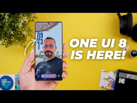
Back to the clock. And now, let me show you the new changes under the clock. The first thing you will see here is a brand new font which is dynamic and it animates in the preview as you see here because when you place your clock it will automatically adapt based on the wallpaper. So let me show you how it looks side by side. The only problem with this new font is it doesn't work with any wallpaper except wallpapers that include real people or animals.
So for example when I try it with any of my wallpapers it doesn't work. So, let me show you a quick example here. So, I'm going to pick one of the wallpapers from my gallery. Then tap on done. As you saw, the clock repositioned itself automatically. And when I try to reposition it on the screen, as you see here, the numbers are adapting to my face profile. And let me make it slightly bigger. As you see, when I move myself, everything dynamically changes. So, let me show you how it looks on the lock screen. Now I have the wallpaper set and on the always on display the numbers look normal but when you switch to the lock screen this is how it animates between the two styles.
It looks really nice and I wish if Samsung could make it work with normal wallpapers like these because I tried more than five wallpapers and none of them did work. Back to the clock editor. All other fonts are exactly the same. No difference. So let's go to style. And by the way, when you use the new dynamic font with different styles, it looks nice as well and adapts with the wallpaper.
But we also got one more style added to the list, which looks very similar to this one, but more opaque. One last change to show you in the clock before jumping to the widgets. When you tap on the color picker on both, you will see that it's now using a blurred background instead of the solid one, which matches the 1 UI8 design more. So that's it with the clock. Now, let's talk about the widgets. I couldn't spot any new ones, but I noticed that the widgets preview are now bigger. And some of the widgets got a slightly different design, like this countdown widget under calendar. And when you go to camera, again, bigger previews. And when you jump to weather, you will see the same exact widgets, but they are ordered differently. But when it comes to the lock screen shortcuts, we got a brand new shortcut here, which is called create note. And as you see, it doesn't exist on 1 UI7. When you select this shortcut, it will allow you to create a note quickly from your lock screen.
And here is how it works. So, let me unlock the phone. As you see, it takes me immediately to a new note, which is a nice touch. And the last thing to talk about in this chapter is the nail bar. And the first change here is the new animation you get when you tap and hold on it. As you see, it expands in a much better way. Instead of suddenly bringing the card on the screen, it animates in a more connected way. Samsung also added some new options to the now bar with 1 UI8.
The first one is the current mode. As you see, I have do not disturb activated on both devices, but only on 1 UI8 I can see it in my now bar, which is not the case here. And when I tap on it, I can turn off do not disturb directly from here. The second addition is the ability to see your calls and meetings directly on the now bar. And in this case, I have a team's meeting on both devices, but only on One UI8, I can see my video call. I can tap on it and jump right away to the app if I want. On a side note, after installing 1 UI 8, some of the apps didn't show me the same controls as 1 UI 7. In this case, I don't see the record and pause button. And it seems like Samsung changed the default settings because now if you want to see the controls on your lock screen, you need to go to settings and then notifications and then app notifications and then open the app in question.
And you need to change the show or hide content when locked to show always to be able to see these controls. And once I I do this, you will notice here that now I can see the uh record and pause button normally. And lastly, let's compare the now bar settings on both. The first thing is the new icon for the media player.
Also, we got here the do not disturb toggle I showed you earlier. And when you tap on view more, all the options are exactly the same. No difference. It's also worth noting that the live notifications at the top are now more transparent than 1 UI7. So, that's everything new in the lock screen. Now, let's talk about the home screen. The first thing you'll notice here is the redesigned widgets. They all got bigger text and less spacing between the items. And the weather widget is a good example. Also, when you take a look here at the battery, less spacing, bigger items as well.
Same as the suggested apps. And you will see the same behavior in all other widgets. And when it comes to this weather widget, when you go to the settings and then scroll down, you will see a brand new section for the font color, which is currently grayed out. But once I turn off the background option and the scroll down, it will be activated to give you the flexibility to choose between white or black font or just set it to auto. There is also some minor tweaks in the widgets picker. For example, when you expand the clock widgets, you will see that in some cases the widgets appear side by side to save space unlike before. And also the previews are now smaller on One UI 8. So that's it with the home screen. Now let's talk about the app drawer and search. The first thing I noticed here is when you drag your finger over the scroll bar on the side, you will see smaller letters.
But most of the changes I'm going to show you are related to the search which got a complete revamp with 1 UI8. The most notable change here is the more transparent containers so you can see through them. Plus, Samsung removed all the carousels, and now all the options appear right away, and the container expands vertically. Plus, we have the downloads and the screenshots side by side. When you take a look here at the recent searches, we no longer have the clear all button, but we have a delete or a trash can icon instead, and all the options are visible without the need to scroll. And when you search for something, you will see even more differences. For example, the show more button right here is now replaced with a drop- down arrow.
And the drop- down arrow remains at the top right corner. While previously when you tap on show more, for you to collapse this card, you have to scroll down and then tap on show fewer to collapse. While currently you can do the action directly from the same spot, which is a lot easier. Another change here is the search in app button got replaced with an arrow next to the title. So instead of tapping on this button now you can tap on the title and both do exactly the same thing. Also the settings will now show you toggles to take quick actions which never been the case before.
And when you scroll all the way down now we have a new show more button instead of search but both do exactly the same thing. So that's it with the search. Now let's talk about the quick settings. And by the way I couldn't spot any difference when it comes to the notifications but there are some design tweaks when it comes to the quick settings. And the first thing you will notice here is the thicker brightness and buttons when compared to One UI 7. Also, when you expand any more menu like this one, you will see more spacing between the items and the cards are bigger as well.
Same applies to the Wi-Fi card. It's slightly bigger than before. The Bluetooth is also bigger and so on. And when you expand the quick settings, you will see some minor visual tweaks. First, the play music got a new music note icon instead of the play icon like before. The smart view got a new icon as well that matches the modes. And when you go to the editing page, you will see a new gear icon next to the panel settings. And that's pretty much it. So, that's it with the quick settings. Now, let's talk about the new sharing options with One UI8. So, I have multiple photos selected, and I'm going to tap on the share button to show you the redesigned share sheet. And also, look at how the photos animate now on the newer version.
Not only this, but the thumbnails are now smaller. The card itself has a floating design instead of stretching edge to edge, and it's using a blurred background instead of the solid one, and we no longer have this handle at the top. Additionally, the new share sheet will give you access to the secure folder. Even though I have the same feature activated on both, but I can only see this option on 1 UI8. When you go to secure folder, you can see the apps over here. So, if you want to share any files from your personal space to the secure folder, you can easily achieve this. Also, when you tap on the more button on both, you will see the same floating design of One UI 8. I also spotted one new toggle. When you tap on options, a toggle that will allow you to choose if you want to include the location data or not. In the change log of 1 UI8, Samsung talked about the updated quick share with the send and receive tabs, which I also got on 1 UI7. So, there is no difference between the two.
But let me briefly explain the reason behind this new receive tab. When you go to quick settings and then tap on quick share, it takes you right away to the receive tab. By this, your phone will be temporarily visible to everyone nearby, regardless your visibility settings. This can be useful in situations where you want to receive some files from people that are not in your contact list. So, you can quickly open this page to be visible for everyone without updating the settings, which is a longer process. And once you quit the page, you are back again to the normal visibility settings you have. Next, the multitasking with 1 UI 8. We got some new features and the most exciting one is the new 90 to10 ratio in a split screen view. So let me show you a quick example on 1 UI8. Now you can make one of the apps very small like this. While on 1 UI7 once you go beyond this size it closes the app as you see here. This new change will give you two benefits.
First you can see a lot more from the currently selected app. And if you want to quickly switch to the other one just tap on it like this. While previously one of the apps will be very small to a point that it's not useful and when you tap on it, it simply interacts with the app. The only way to mimic the same scenario is to double tap between the two windows like this. But as you see, this gesture is not easy to to handle like this one. This one is a lot easier and give you the best of both worlds. And the second change in this area is the redesigned pop-up view window.
So, let me activate it on both. So, when you tap on this bar and then go to pop-up view. Now, you will see this redesigned window. First, we no longer have borders around the app, which will give you more screen real estate. Plus, the menus at the top are now hidden, and you can tap on this blue bar to reveal all of them. And as you see, they appear in a new floating rounded container. Plus, all the options are now visible at the first glance. Instead of having two more options under the ellipses, now everything is available. Plus, Samsung updated the minimize button to be like a dash instead of having those two arrows.
By the way, if you like any of the wallpapers you see in this video, they are now available in the wallpapers by in-depth tech reviews app that you can find over here. And by the way, you can download any of these wallpapers locally on device, which will allow you to apply the wallpaper effects of your operating system on them. and that will give you an extra edge. If you want to download these wallpapers, you can find the Google Play Store download link of the app in the description. And now, let's get back to One UI8. Now, it's time to talk about all the new changes under settings.
And the first one is located under connections and then Bluetooth. When you tap on the ellipses, then go to broadcast sound using OraCast, you will see a redesigned page on both devices. Here is how it looks. Now you can see the same information, but we got this new tutorial. And when you tap on start broadcast on both devices, you will see a redesigned page that will give you quick access to the password. You can share your broadcast using a QR code and also stop the broadcast from this button which is much bigger than before.
The next change is under connected devices and then Samsung Dex. And now you'll see a redesigned settings page in addition to a lot of new features that I'm going to show you in the Dex chapter. But here I'm going to only show you the updated settings page. Next, under Galaxy AI, now you have the ability to use Galaxy AI with the secure folder, which wasn't the case before. And when you tap on it, it will ask you for the PIN, and then it will show you this wizard, which will let you know about each and every feature.
When you tap on continue, it will ask you to sign in with your Samsung account or Google account to continue with the activation. Under modes and routines, when you go inside any of the routines, you will see a much bigger turn on button. Plus, Samsung added a lot of new actions and the triggers under the routines tab. So, let me show you how they look side by side. Starting with the triggers, when you scroll all the way down and then go to the event section, you will see a new option here called exercise ended.
Plus, we have some new icons here. As you see, the unlock with fingerprint now has a different icon and you might see the same in other options. Also, under the call, we have a new call ended trigger. And these are the options you can choose from. But when it comes to the actions, we got a lot more. So, let me show you what we have. Starting with the connections, here you will find a new option called show Wi-Fi QR code. Under sound and vibration, we got a new one called boost dialogue.
Plus, the options are now ordered differently. Under functions, you will see a new option here called show custom pop-up. And this will allow you to show whatever text you want on the screen. And when it comes to Samsung apps, we got more options. Now we have calendar, reminder, and Samsung notes. Starting with calendar, these are the options we have now. And when you go to clock on both you will see a lot more options on 1 UI8 and they are categorized differently. Here we have create alarm update alarm and then you have dedicated section for the stopwatch and then the timer and finally something called get which will allow you to find alarms as well.
And here are the options underneath it. And when it comes to gallery you will see the same options except one new option here called find images. And here is how it works. Then let me show you the options under reminder. Here are the options you get. And finally, we have Samsung notes. And here are the options. Last but not least, under get, we got a lot more options with a new icon as well. So let's go inside. And the first one we got here is called get currently running routine. Get current context. And when you scroll down to connections, you will see a new option called get mobile data usage.
Under the device section, we got a new option called get auto rotation status. Then the event category is now called health and it includes the same get exercise status in addition to three more options. And finally on 1 UI7 the last category is weather but now you can scroll further to find things like Samsung notes reminder clock and gallery. So that's everything new under the routines tab. Now let's go to discover. And here you will find a lot more suggestions. For example, we have a new section for weather routines. We have one for advanced routines. The smart things is exactly the same. And we also got one more suggestion under the more accessible category. Now let's move on to sound and vibration. And here I'm going to show you a new option under sound quality and effects called boost dialogue, which is the same one I showed you under the modes and routines menu. And when it comes to the notifications, you will see a lot of tweaks starting with app notifications.
Now we have a tab for the secure folder. Not only this, but the sort option is now located on the right side instead of tapping on the old word and the page got a new design as well. The next menu is the notification pop-up style, which now got a new description. And when you go inside, you will see different options. We no longer have the ability to adjust the apps to show as brief. But if you want to modify this option, you need to open each app separately like this. And then it shows how you want to show the pop-up style. So I think previously it was easier to adjust everything from here. Then we have the edge lighting style now called add lighting effect.
And when you go inside you will see less options as well. We no longer have this color option. Plus, when you go to advanced, we no longer have the transparency slider. Back to the notification settings. I also don't see this color by keyword option. It's missing from here. And we have a toggle here called show brief pop-ups even while screen is off. And it says here, show even while screen is off. So, this one is longer, but both do exactly the same thing. Then we have a separate menu for the hide content while unlocked which was previously accessible from the lock screen notifications. And you'll see that now we have some visual cues that didn't exist before.
And if you want to access these settings, they are now located under a separate section called appearance then lock screen. And here you will find the rest of the options. Then we have another dedicated menu for the sort and filter notifications. Previously, to access the same settings, you need to go to advanced settings and then you have the sort option here. And then you have the filter options right here. For the status bar and do not disturb menus, they are exactly the same. No difference. But when you go to advanced now, you can see less options because most of these options have been moved elsewhere. So that's it with the notifications. Now let's talk about the battery which you got a simpler icon as well. And when you go inside, the only change you will find here is under the battery protection. Now we have the adaptive option as a toggle and it's called adaptive protection and it also got a brand new description.
Other than this, both work exactly the same. Under security and the privacy, you will see some new options as well. The first one is a visually change and as you see the suggestions banner at the top is now a lot smaller. Then when you go to more security settings, you see that we no longer have a description. And when you go inside, I don't have the same secure Wi-Fi option.
And when you go inside the secure folder, we got some new changes. The first one is the lock type is now called secure folder lock and biometrix. And when you go inside, you will see some differences as well. When you take a look at the fingerprints option, previously it was a toggle to turn the feature on or off. And it simply uses the same fingerprints you have set up on the device. But currently you can add separate fingerprints for your secure folder. And when you go inside this menu, you can see I added a separate fingerprint and I can add more if I want. Plus I have the ability to check added fingerprints.
And it says here fingerprint one. And then I have the fingerprint unlock toggle. Same as before here as well. Back to the main secure folder settings. And when you go inside notifications, you see that they are now using radio buttons instead of the toggles, but both work exactly the same. Then under more settings, we no longer have the aspect ratio option as before. And when you go to the other security settings under the secure folder menu, you see that now we have a new option called show secure folder apps in share panel as I showed you earlier in the share sheet. So if you want to share files from your personal space to the secure folder, you can activate this toggle. One more thing I missed to mention here is a new toggle added to the top called allow background activity while locked and I don't see it on 1 UI7.
Plus this toggle which is called add secure folder to apps screen is not visible on 1 UI8. So let me show you what else we got with the secure folder when I open it on both devices. The first thing you will notice here is the new dot at the top right corner to indicate that we have some new options. And when you expand the menus on both now we have something called hide apps and hide secure folder.
Starting with the first option, this one should hide apps and also block the notifications from them. So when you tap on it, it will show you the apps in your secured folder. So you can hide whatever you want. But I couldn't find the quick way to unhide these apps. For me to access them again, I have to tap on the ellipses, go to hide apps, and remove them. And that's the only way. And the second one is called hide secure folder. It's very similar to the toggle we have under the secure folder in 1 UI7, which is add secure folder to apps screen. So if you don't want this to happen, you can use hide secure folder. But the only difference between the two is the new option now encrypts the secure folder, not only hide it like before. And when you tap on it, it will give you a description over here. It says hiding secure folder provides an extra layer of protection. While hidden, the secure folder app icon will disappear and apps and data stored in secure folder are encrypted.
Apps won't work and you won't receive any notifications from them until you unhide secure folder. To unhide secure folder, tap the secure folder button in the quick panel. So when you tap on hide secure folder, everything will disappear and you have to go to the quick settings to locate the secure folder. But you need to add the toggle first. So let me add it really quick.
So as you see now I have the secure folder tile added to the quick settings. And once I tap on it, it will ask me for the pin and unlock it for me normally. But keep in mind once you enter the pin and access the secure folder and then go back to the home screen and search for it, it will be still visible. So if you want to hide it again, you need to tap on the ellipses and then hide secure folder again to get back to the same state. So that's everything new under security and the privacy. Now let's talk about the new changes under advanced features. When you go to the side button and then tap on the double press option, now we have the ability to start Samsung wallet by double pressing the power button. And here is how it works. So as you see, it started the app immediately. And the last thing to talk about under settings is the new accessibility features. Starting with the vision enhancements, when you go to magnification, you will see a new toggle here called the magnify keyboard while typing.
So, let me show you what happens if you have the magnification set to full screen. As you see now in 1 UI 8, it can magnify the keyboard unlike before. Back to the accessibility settings. And when you go to hearing enhancements and then hearing aid support, now you can pair a hearing aid device directly from this page instead of going to a separate page like before. And when you go to advanced settings and then go to the accessibility button or gesture and then select actions, when you choose the assistant menu and then choose the shortcut action you want when you open it now and then go to the pinch zoom option. As you see now we have a plus and minus button on the screen instead of only using the gestures like before. And finally, under the interaction and whatever menu, when you scroll all the way down now, we have a new menu called mouse keys.
When you go inside, you can activate this new feature, which will allow you to use the keyboard keys to move the pointer on the screen, which is used for Dex when you have an external keyboard connected to the phone. And it will tell you here how you can move the mouse. There is one final change that I was about to miss is located under the developer options. So, make sure they are activated first and then search for something called terminal. Scroll all the way down and you'll find the new experimental Linux terminal on your S25 Ultra. And when you turn on the switch, you will be able to use this feature. Then go to your apps and locate the new terminal app.
You will find it right here. And when you open it for the first time, you will need to install it, which requires 525 megabytes of data to be downloaded on the device. So, let's wait for it and show you how it works. Unfortunately, after downloading the data, I got an error and I tried to fix it by resetting the installation, but it does the same thing every single time. So, that's it when it comes to settings. Now, let's talk about the new features in Samsung apps. Let's start with the internet app. And the first change is in the menu. Now you will see a complete redesign. First it has a transparent background. You can see the website link over here. So you can share it immediately. Plus now you have a dock and a separate container for the rest of the items that you can scroll through horizontally instead of vertically. Plus when you try to edit these items you will see a totally different page.
First each section now has a title. So, for example, we have the available buttons, the menu, and the toolbar. But previously, it was hard to tell if this part is the menu or this one. But now, everything is clear. Secondly, you get a minus button next to each one. So, you can quickly remove items from the list like this. And at the top, it tells you that you can touch and hold to move items. So, it gives you a hint on how you can organize things. But those two options didn't exist before. And lastly, when you take a look at the top section, you will see that the customize menus title got removed and we got a new done button because now when you make any changes to this area, you have to tap on done to apply them.
But previously any change you make will immediately reflect on your menus. We also got one minor change under settings. The security and the privacy is now called privacy dashboard, but both work exactly the same. Now we are done with the internet app and now let's talk about the new changes under gallery and I will start with the photo editor. The first thing you will notice here is the better organization and smaller buttons. For example, the AI editor is now a lot smaller and on the same line with the rest of the options.
These three buttons are now grouped together with the rotation options under the same container. And when I expand any of these options, you will see that the photo moves up and down. But previously this wasn't the case. When I expand anything, the photo remains in place. Another minor change is the updated filters icon. But there is no difference in the functionality. And when you go to decorations and then go to text, you'll see here that this box is now hiding the font. And you need to tap on the handle to expand like this. But previously you can see everything immediately. And the last change under the photo editor is the redesigned undo and redo buttons. Moving to the video editor, you will see a similar design language. Instead of having big buttons like the adjust speed one, now it's just an icon next to the play and pause chip that you can expand and collapse.
And when you go to the crop, you will see the exact same differences we have seen under the photo editor with the new icons as well. Moving to the search, here you will see a redesigned search bar. And when you tap on both, you will see that the recent searches and suggestions swapped places. And we also have a title for the suggestions. Plus, now you have the ability to clear individual items from your search history, which wasn't the case before. Moving to the stories page, there are a lot of new design changes. But because I don't have enough photos on my S24 Ultra, I will put a screenshot from the S25 Ultra when it used to run 1 UI7 to be able to see the difference between the two.
The first change is the new gradient color behind the stories that will change based on the photo colors. Here I have purple and here turquoise. Plus, we have some quick shortcuts over here like the ability to immediately add the story to your favorites by tapping on this button over here. We also got a small counter and an animated sand clock icon. Unfortunately, once I added the stories to my favorites, they disappeared from the top carousel and I couldn't revert this action. So, let's move on to the next change, which is the new suggestions that appear on top of the text box.
So, you can quickly access them from here instead of tapping on the search bar first like before. And the last change in this page is the created by you title is now called create a story, but both are exactly the same. Last but not least, the app menu got updated with a new transparent background and redesigned buttons, which is something I already talked about in my previous video. Next, the clock app. And here I'm going to show you two new changes. The first one is under alarms. If you already have a group, when you tap on the plus button, now you have the ability to add your existing alarms to the group. The second change is related to the widgets. Now, when I add an alarm widget to my home screen like this, and then tap to select the alarm I want.
Now, I have the ability to select a group, not only individual ones like before, which will make it easier for me to control multiple alarms from my home screen. Now, let's talk about the new changes under the reminder app. And the first one is the removal of the side menu that includes the automatically created categories. And now you get immediate access from the main page. And the rest of the categories you created have their own section that you can collapse or expand like this. Plus, when you start scrolling, you will notice here that everything will collapse automatically. and it will also show you a tool tip with the name of the section you are currently viewing which looks really nice. Samsung also reordered a lot of the menus. For example, the trash and settings are now accessible from the ellipses. The sorting options that used to be over here are also located under the ellipses. And we got two new options, ascending and descending.
And when you expand the two menus, you will see a lot of new changes. First, we got this new sync. now button. The edit option is now called select. The view option that used to have card or list view got removed and now we only have the card option. We also got a new option called manage categories that didn't exist before. It will take you to a page similar to this one, but the main difference between the two is now you can immediately tap on the category to edit. But previously to do the edits you need to tap on hold first and then tap on edit to access the same page. Plus Samsung removed the ability to pin or unpin categories. So when I tap on hold on any of them I only can edit or delete or reorder by using the handles but I cannot pin the categories.
The hide all categories card option got removed because now you can simply hide or unhide your categories like this. Plus, they also removed the hide completed reminders and also the pin important to top. But you still can access this one under settings. When you go there and then scroll down a bit, you will see that now we have the pin important reminders to top under settings instead of showing under the ellipses. Another change under settings is the notifications toggle is now called shared reminder notifications and it's located under the alerts category instead of having its own category like before. And as you see, we still have the alerts category in the previous version. So now it makes more sense to include all the alerts under one section. Back to the main page, when you scroll down, you will see a whole new section for suggestions that you can collapse or expand like this. It will show you some readym made reminders that you can immediately use after applying your edits which will save you some steps in addition to the updated text box. The first change here is the ability to use the microphone to create your reminder which wasn't the case before.
The plus button that takes you to the full screen view is now gone. And when you tap on the text box now and type anything now you have the ability to switch to the full screen view immediately by using the handle which is sometimes buggy. As you see here I can reach the same view directly from here or I can cancel and only use the text box that has much more options when compared to the previous version. The main difference between the two is the ability to create everything directly from here without the need to go to the full screen view. For example, when you tap on the calendar button, we used to get only the presets with the ability to add a custom preset if I want.
And then I need to tap on the time to choose the time. But now when you expand the same page, you will see all the options you might need. You have the presets, you have the custom date and time. So you don't need to go anywhere to finish your reminder. And the same applies to the location. When I go to the location here, I can only access the presets. While here, I can access both the presets and also pick a custom location. I can add photos. I can choose which category to list it under. And also add checkboxes, which wasn't the case before. But if you want to get the same options in the previous version, you have to go to the full screen view.
And the last change in this area is the automatic suggestions you get while creating your reminder. So once I typed the word grocery now it suggested a grocery list. So it added the items for me and I can use this as a template to save myself some steps. The next app we have is the calendar app which got three new changes. The first one is the updated stickers icon. As you see both work exactly the same but the icon is different. And now you have the ability to create a reminder directly from the calendar app, which is a nice touch. And finally, when you try to create a new calendar event and start typing things related to what you already have in your calendar, you will see some suggestions at the top. Now, let's talk about the contacts app, which got two new changes. And the first one is the updated profile card page. The first change is the create profile card button is now removed and now you can tap anywhere on the top half to get access to the same page.
So let me choose one of the photos I have to show you the difference between the two. This is the exact same photo. And here you will see a totally different design. The first change you will notice here is I'm getting the proper preview that matches my phone design which is portrait. While here I'm getting the square one meant for tablets and foldables. Plus, when I tap on preview, you will see that the portrait one is misaligned in the older version which doesn't look great. But now I'm getting better alignment. Also, we have all the buttons at the bottom of the screen which is much easier to access. You have the change image, you have the text, and then we have effect, the portrait studio. So, as you see everything is located or scattered across the screen. But now things are ordered logically.
Plus, we got a new option here called also use as profile picture. So you can use the same photo for both instead of doing it two times. Another change here is when you tap on your profile picture only, you still can access the profile card from here, which wasn't the case before. The second change is the ability to access core recordings in contact history.
So when you open the contact page, you will see all the related recordings all in one place which will make it easier for you. I don't have any recordings to show you how it works in action. But this is a screenshot from Android authority. So that's it when it comes to the contacts app. Now let's talk about the camera. And the first change is the ability to swipe up to access the quick controls instead of switching the cameras. But this feature needs to be activated under settings. Previously, we used to have a toggle called swipe up or down switch cameras, but now it's a drop- down menu, so you can choose between switch cameras or open quick controls.
I also spotted a couple of new changes under advanced video options. Previously, we used to have a drop- down menu to prioritize video quality or saving space, which is now gone. And the HDR 10 plus videos is now called HDR. Now let's move on to the weather app which got some new changes. The first one is the newer and updated animation. As you see it looks more natural and much better in comparison. Plus we got a more transparent background. Same as all other areas in 1 UI 8. The second change is under settings. Now when you go to units you will see a new option called hybrid which is a mix between the matrix and imperial. So that's it when it comes to the weather app. Now, let's talk about the AI select. And the first improvement is the ability to immediately select what's on the screen without the need to wait for the animation. And to try this, I will try to immediately select what's on the screen once I trigger the feature. So, as you see, this one didn't work while 1 UI 8 did allow me to select the car.
Plus, I found one more change is when I tap somewhere on the screen like this, it goes in full screen view, which never happens with the older version. No matter where I tap, it never goes to the full screen view. While here, I can do this and it will pick the full screen in some cases. The My Files app also got a couple of new changes.
The first one is the redesigned categories and they are now located at the top. And the recent files now have a separate page that you can access by tapping on the title or this arrow. And here you can filter the files by the app name. So for example, if you received a file through Google Chrome, you can immediately filter the list and it will also include quick share if you received any files using this feature. Next, Samsung Health. And we got two new features in this app. The first change is under the together tab.
When you try to create a challenge, which is not possible on my S24 Ultra because I'm using the same account, then choose running or walking, you will see here a new option called get there first. So instead of having a distancebased challenge only, now you can make it timebased as well. The second feature as per Samsung's change log is the ability to enter your food intake to track your calories, but I also found this feature available on my S24 Ultra. Now, it's time to show you all the new changes in Samsung Dex, which you can access by going to settings, then connected devices, then Samsung Dex. And here you'll find a lot more options that didn't exist before. Starting with the connected display. From here, you can switch between extended or mirrored.
And when you get back to extended, it will show you more options. But for some reason, sometimes it doesn't load. And I have to refresh the page. Back again to the extended view. Here we have a toggle called flow pointer to phone. And this one will allow you to move the mouse pointer from this display to the phone and vice versa. And that's when you can reorder the two displays the way you want. And once you turn off the switch, this option will be grayed out. Then we have two options here to adjust the font size and screen zoom. So let me show you how it looks on the app drawer. Uh this is the maximum size you can get and this is the smallest one. So it takes time to reflect. And then we have another one for the screen zoom.
This is the biggest size and this is the smallest one. Then we have the display resolution. So it depends on the display. You can go up to 2K I think. I'm not 100% sure but this one is 1080p and I can also make it HD plus. Uh then I have the ability to rotate. I have 90° 180 or 270. And you can return back to zero as well. Then we have a separate screen timeout setting for Samsung Dex separate from the one on your phone. And here you can choose that time. You have up to 60 minutes. And you can also keep screen on while viewing if you want. And the description says keep the screen on while you are looking at it using the front camera to detect your face. So that's everything new under the connected display menu. Now let's go to keyboard. And here you will see the onscreen keyboard location either TV or monitor or phone. And you can also activate this toggle to show the onscreen keyboard in Samsung Dex. And here you have more settings that will take you to the settings app. Then you have the mouse and the trackpad.
And here you can show the touchpad when Dex runs automatically. And then you have the touchpad scrolling direction, the touchpad gestures, three fingers or four fingers with more settings again here in this area. Plus, we have the S Pen input mode. You can use the hover mode or to use your S Pen as a mouse by hovering the pen over the phone without touching the display or you can make it a mouse mode which requires touching the display. Then we have the play sound on connected display. So once you connect the phone, it should play a sound on the display. So that's pretty much it for today. These are all the new changes in 1 UI8. Please let me know in the comments if I missed anything. But for now, thanks so much for watching and see you in the next.


