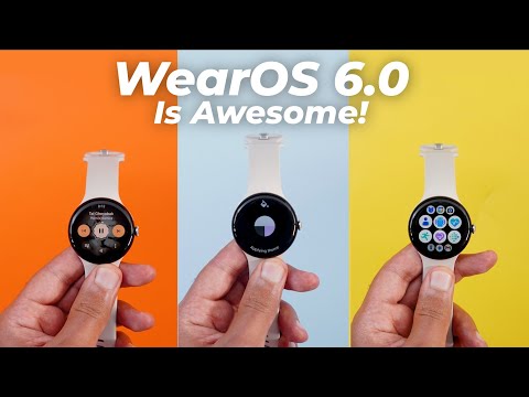
Hello everyone and welcome to the channel. Today is a very exciting day as Google released where OS 6.0 to older Pixel models along with the release of the Pixel Watch 4. And here I have the update on the Pixel Watch 3 to show you all the new changes. So without further ado, let's jump in. First things first, if you didn't get the update on your Pixel Watch, head over to settings and then scroll all the way down to system, then system updates. Then keep tapping on this watch icon at the top until you get the update pushed to your Pixel Watch. And as you see, I'm running September 5th, 2025 security patch. And when you go to the about screen, you will see that here I'm running 6.0. And now let's take a look at the new features which are very exciting. Let's start by talking about the redesigned quick settings. And the first thing you will notice here is the ability to see nine different tiles at the first glance. Six out of which are immediately available while the other three are minimized at the top row.
And once you start scrolling, the tiles become bigger. And I do really like this new scrolling animation. Not only this, but when you interact with any of the tiles, they have the same material 3 expressive behavior. The tile changes from an oval shape into a rounded square. Also, the phone status icon at the bottom is now surrounded with a container. Plus, Google updated all the icons that you see now on the screen with a bigger text for the battery tile. I also found that when the tile requires a confirmation like this one, when you scroll all the way down, you will see redesigned tick and X buttons, now each one has its own shape and the tick button has a different color to make things easier to identify. I also found that the touch lock tile got replaced with a new one called water lock and it got a new icon that looks like a water bubble.
When you tap and hold on it, it will take you to the settings page where you can toggle the feature on or off. And it also explains how the feature works. It's exactly the same as the other one, but it has a different name. And when you activate it, you get this confirmation message that you can ignore. And once this mode activated, the touch screen stops. So in case you are swimming with your Pixel Watch, you can activate this feature to avoid any accidental touches. And to get out of this mode, you need to press and hold on the crown for two seconds. So that's it with the quick settings. Now let's talk about the notifications shade. And the first thing I noticed when I start scrolling, the previous and next notifications are now a lot smaller, which will give more space to the currently active one.
So you can read more text, which is a nice touch. Not only this, but the notifications that include any images, they now appear in this new rounded rectangle. And I have multiple ones to show you. Here's another one. And here's one from X. So you can see all of them are using the same design language. Not only this, but when you try to dismiss any of these notifications, you see two different things. First, we have a brand new animation. And when you reach about 50% of the screen, the button changes into a clear button and it gives you a haptic feedback as well.
And the same applies to the other side. And this what happens when you completely dismiss it. And when you tap on any of the notifications and then open on phone, you see this brand new circle which is much bigger than the previous one. And when you interact with the notification on the watch itself, you will also see another new animation. It's a text sign inside a material U shape that animates in a bouncy way. I also found that all messaging apps show the profile picture of the contact inside this material U shape with a bigger app icon as well. And here is how the full screen notifications look on where OS 6.0.
And lastly, the clear all button also got updated with the same rounded shape that we've seen in other tiles before. And when you tap on it, here's how it animates. So these are all the new changes in the notifications shade. Now let's talk about the app drawer that also got redesigned. As you see, it got the same design language as the quick settings. Six apps and the last row will show you three more minimized apps. But when you start scrolling, you can see up to 12 apps on the same page. And here is how it animates when you scroll up or down. And when you go all the way down to the list view button, as you see, it got the same rounded shape as all other buttons.
And here is how it looks in the list view as well. Back to the grid view, which is my favorite. It's also worth noting that you get a haptic feedback when you quit the app drawer. The same applies to closing apps. When you close it like this, it gives you the same haptic feedback. And when you navigate between pages within any app, the same happens. Plus, as you see in the settings app, we got this new predictive back gesture animation similar to the one we have on our smartphones. And when you reach about 50% of the screen, you get the same haptic feedback as well. It's also worth noting that the systemwide scroll bar that we see on the right side got updated with this brand new rounded design. Next, the recent apps screen which also got redesigned as you see here. It uses the same scrolling technique we've seen everywhere. And when you scroll all the way down, it gives you this rounded button that takes you right away to all apps. Now, let's talk about the media controls of WS 6.0, which I really love. The first thing you will see here is the album art is showing in the background and if the song name is long, it animates at the top.
The progress is now around the play and pause button and it has a squiggly design. But once you pause the music, it turns into a normal circle. And as you see, it animates when I tap on it. Plus, when you move next or backward, as you see, that's another new animation you get as well. Not only this, but the colors change based on the album art colors. Here we have some quick shortcuts. One takes you to the queue. We have one for the volume. And when I tap on the volume buttons, they turn into rounded squares as I tap on them. And then we have the ellipses for the rest of the options. So that's it with the media controls. Now let's talk about Gemini. When you use it for the first time after installing W OS 6.0 or on your Pixel Watch. It will take you through a wizard on the phone to activate the feature.
And here's one of the pages I came across. It seems like Google added a brand new gesture to trigger Gemini on your Pixel Watch, which is the ability to lift and tilt your wrist or tap the screen, then say the magic word. Previously, to trigger the assistant, you either need to tap the screen or press one of the buttons. But currently, all you need to do is to lift your wrist and tilt it like this. then say the magic word which is a lot easier. Now it's time to talk about all the new changes under settings and the most exciting one is under display. Now we have a new option called color theme which will allow you to choose a color palette for your Pixel watch same as the phone. We have no theme. We have some presets and the first option called match watch face. And when you set it to this one, every time you change the watch face, it will automatically update your color palette.
So let me show you how it works. So for example, when I choose this watch face which is mainly blue, it gives me a splash screen saying applying theme. And now all the buttons, the notifications, even my settings are turning into blue. And when I change it to something else like this one, which is mainly yellow, it did the same thing. Everything is now different.
So you have a similar functionality to your mobile phone. Plus, you still have the option to choose the no theme option. And in this case, it will use the default blue color everywhere regardless what's on your watch face. It also worth noting that I tried to add some custom wallpapers to my Pixel Watch from the wallpapers by in-depth thick reviews app while having the match watch face option selected under settings. But unfortunately, the system doesn't pick the wallpaper colors and it keeps applying the same default blue color as if I'm selecting the no theme option. So, I hope Google can add this functionality to the photos watch face to be able to match our wallpapers, which will be a really nice feature.
Talking about the wallpapers, if you want a great collection, you definitely need to give the wallpapers by in-depth thick reviews app a try. You will find a lot of amazing wallpapers to choose from. Plus, you have the ability to download any of these wallpapers locally on device, which will allow you to set the same wallpaper on the phone and the watch, and that will give you a really nice match. If you want to check it out, you will find the Google Play Store download link in the description. And now, let's get back to where OS 6.0. Another exciting change under settings is the addition of the adaptive charging mode, similar to the one we have on our mobile phones. You can find it under settings and then battery. And when you scroll all the way down, you will see the toggle over here. This is a really nice feature because it will extend your battery lifespan by charging steadily during larger charging periods and it will be activated based on your usage cycle. So these are all the new changes under settings. Now let me show you some random tweaks here and there and I will start with the keyboard.
You'll notice here that it supports the adaptive theming and some of the buttons are now colorful. Also, when you go to the emojis, you will see the same thing. The buttons are using different colors, same as the ones at the top. And when you start scrolling, you see this new animation that didn't exist before. I also found that the date complication is using a bigger font when compared to the previous version. So, as you see, the month is written in a much bigger font. And when it comes to the tiles, all of them on where 6.0 all support the material 3 expressive design language. And I have to say that all of them look impressive, especially the rounded ones that look really nice with the circular design of the Pixel Watch.
Plus, we got this stunning weather tile that gives you all the information you might need. And when you tap on any of the cards, it takes you to the Pixel Weather app on the Pixel Watch. And as you see, it looks impressive. Last but not least, Google updated the boot animation on the Pixel Watch. So, let me show you how it looks. Once you unlock your Pixel Watch after a restart, you will see this new hello screen. So, that's pretty much it for today. These are all the new changes in W OS 6.0. Please let me know in the comments if I missed anything. But for now, thanks so much for watching and see you in the next