This is Google Apps Updates roundup number 111. In this episode, I will show you more than 45 new features in 15 different Google apps. So, make sure all your apps are up to date and let me show you what's new. Let's start the episode by talking about YouTube Music. And here I'm going to show you two new changes. The first change in YouTube music is the redesigned now playing screen. And you will notice here that the song and video switcher at the top is now gone. And to do this, you can find the option in the carousel at the bottom. And when you tap on video, it will switch into a song. And this is how you can toggle between them. Also, the carousel buttons are now much smaller than before.
And now you can see the number of shares for each song next to the share icon. The second change is the new lyrics sharing feature. When you tap on the lyrics, you will see a new share button here at the bottom. Tapping on it will allow you to choose a certain part of the lyrics. You have up to five lines to choose. And once you tap on more, it will start over again. Once you are happy with the selection, you can tap on next. And here you can adjust the color. As you see here, you have plenty of colors to choose from. Once you're happy with the selection, then tap on share. It will give you the option to save it as an image, share with other apps, or share it as a story on Instagram and Facebook.
The next app we have is Google Photos. And here I'm going to show you six new changes. The first change is the updated album editing page. So when you tap on the edit button, you will see some design tweaks here. The first thing is the ability to add a highlights video, which will automatically create a movie from the photos in your album. And once it's created, it will appear here at the top and you can still edit the video if you want or remove it. Then we have the album cover which you can also edit. Then you have the title and finally you can add a description. Here at the top you have a tick button to save the changes or sort the photos the way you want. And at the bottom you will see a navigation bar that will allow you to add more photos. You can add an extra text field other than the description. And finally, you can add a location.
Pick one from the map or add all the suggested locations to the same album. And here's how they look. The second change is also related to albums. Now, when you share an album, you will see a new option here called show QR code, which will allow you to share this album using a QR code. And this is how it looks. And after sharing an album using a QR code, when you open it again, you will see a chip at the top with the sharing options.
Here you can deactivate the link sharing. You can copy it, show the QR code again. And here you have some extra sharing settings like collaborate, comments and likes, share photo locations, and here you can add more people if you want. The other changes are only available on iOS. So let me show you how it looks. Now, when you open any photo, you'll notice that the bar at the bottom looks different with new icons. And we should expect this new design on Android very soon. Here you have the share, edit, add to, and the trash. And you also get some suggestions like Google Lens search and the crop that you can close using the X over here. And this is how it animates when you expand the info pane. As you see, it's smoother than the current version we have. And when you tap on edit, you will also see a new create section here that will allow you to create a highlight video, collage, or a cinematic photo.
We also got a new feature similar to the one we have in Apple photos, which is the ability to pinch like this and then crop the image right away on the same exact view by using the crop suggestion over here. So, you don't need to go to the editor first to take the action. And when you tap on the add to button, it will give you three options. Either to add it to an album, archive or the locked folder. And at the top right corner, we have the ellipses. Tapping on it will reveal more options like the about which expands the info pane.
Then you have the Google lens search. And this what happens. It will immediately overlay Google Lens on the photo or over the photo. Then we have create. And this one will expand to show you collage, highlight, video, and cinematic photo, which is the same section we have under the photo editor. Then you have cast and download. And at the very top, you will see the date and time of the photo. And the last change I spotted on iOS, if you are in any of the automatically created albums that are usually listed under the documents category, when you open any of these photos and then tap on the floating tag at the top, it will give you the chance to change the category.
And here you have all the categories identified under the documents section. Or you can jump right away to all documents which will take you to the albums. Before jumping to the next chapter, if you like any of the wallpapers you see in this video, they are now available in the wallpapers by in-depth tech reviews app. And here are the latest additions. And if you don't know, now you can download any of these wallpapers locally on device. So you can apply any of the system effects on your wallpaper by using the download buttons over here. Plus, you have the ability to edit the wallpaper before downloading, which will give you even more flexibility. You will find Google Play Store download link in the description. And now let's get back to Google Apps. Next, we have Gc Cam version 9.9. And here I'm going to show you five new changes. The first change is related to the indicators at the top left corner.
First, they are now bigger than before. And secondly, they are now tapable. So, for example, when you tap on this one, it will take you to the relevant settings and it will highlight it for you as well. And for example, when I go to the macro mode like this and when I tap on it, it will do the same thing for me. The third change is the roll out of the camera education feature which is part of June 25 feature drop.
You will see this question mark at the top right corner all the time. And when you tap on it, it will take you to a whole new page where you can learn more about your camera. It will list all the features you have on your Pixel phone that you can explore. And when you scroll all the way down, you will see a more tips section. For example, when you tap on any of these options, you will see two tabs at the top. One for video examples and the other one is how to. When you tap on any of the examples, it will show you exactly how you can use the feature. And when you go to how to, it will give you a guidance on how to use the feature by using a graphical representation over here. So it tells you exactly the steps you need to follow and they are also written at the bottom with a with a button to open the camera and start doing the steps yourself. Change number four is the updated timer icons.
Previously, they were outlined, which is no longer the case. And the last change is a feature loss. In Gcam version 9.9, we no longer have the social share feature. Now, let's talk about Gemini. And here I'm going to show you six new changes. The first change is the availability of the live camera and the screen sharing to everyone. Previously, those two features were available for free to the Pixel 9 and the S25 models, but now regardless your phone or Google account, you can get access to them. The second change is the ability to use Gemini to identify songs. And here is how it works. What's the name of this song? Once you say this command, it will start the same hum to search feature we have in Google app. The third change is the ability to upload videos to Gemini and ask whatever you want. So here is one of the videos I have in my gallery and you can ask any question and then send it to Gemini.
Change number four is the new scheduled actions feature. Now you can ask Gemini to do certain actions based on a specific schedule. And for example, I will ask it to send me Dubai's traffic report every morning at 8:00 a.m. And then tap on send. Now it's done. And as you see, the scheduled action is now created. And it says here, I will send you Dubai's traffic report every morning at 8:00 a.m. Ask me to edit or delete your scheduled action at any time. And here's the action that you can pause as well. And if you want to access all all your scheduled actions, you need to tap on the profile menu.
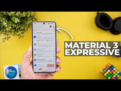
And then you will see a new menu item here called scheduled actions. When you go inside, you will see all of them. From here, you can pause or you can simply delete the action if you want. Change number five is the ability to validate Gemini answers by scrolling all the way down and you will see this new button over here. When you tap on it, it will highlight the validated info in green. And when you tap on this drop-own arrow, it will tell you the exact source of this information. And in some cases, you might see a red highlight. And in this case, it doesn't have an online source to back it up. And it requires further research from your side. And lastly, if you are running Android 16 QPR1 beta 2 on your Pixel phone, when you press on the power button to trigger Gemini, you will see this brand new animation. Next, Google Messages. And here I'm going to show you three new changes. With the latest update of Google Messages, I started to see the Material 3 expressive redesign in certain areas. And the first one is under settings.
Look at the difference between this one and the previous version. And for reference, here is the old settings side by side with the new one. The second page that got material 3 expressive redesign is the search. Now the filters are stacked vertically in a 2×4 grid. And for reference, here is the old design. As you see, they are totally different and the size is much smaller. Also, the search bar at the top is white instead of gray. And when you tap on any of the filters, you will see that the results are now separated from the background in their own white container.
And the individual items have more separation as well. Another visual tweak in the material 3 expressive version is the monochrome profile icons and simpler glyph icons at the corners, which looks different from the previous version. And when you start a new chat and search for a specific contact, now you can see if this contact has the RCS messaging activated or not. And finally, we got the snooze feature, similar to the mute notifications feature in WhatsApp. And when you highlight any of the conversations, you will see the snooze button here at the top. When you tap on it, you can choose between 1 hour, 8 hours, 24, or always.
And that's exactly the case with WhatsApp. in addition to the delete for everyone feature I talked about in my previous episode. Next, Google Maps. And here I'm going to show you three new changes. The first change is the reappearance of the media controls while navigating. So, for example, when you start the navigation, you will see here that I have the media controls button. And when I swipe up to expand the navigation card, as you see, I have YouTube Music over here. And I can also choose Spotify if I have it installed on the device. From here, you can play and pause, move forward or backward and browse more music. To activate the media controls option, you need to expand this card, then jump to settings and look for show media controls toggle. Once you activate the switch, the feature will show up right here. The second change is the Material 3 expressive profile menu that looks similar to the ones we've seen in other apps.
And lastly, the Google Maps logo at the bottom left corner is now using a black color in a set of Google colors like before. Next, Google contacts. And here I'm going to show you two new changes. The first change is under the organize page. Now you will see a banner at the top showing you how many contacts are synchronized to your Google account which is also written here at the top. When you tap on this banner, it will take you to another page where you can see the syncing status and you can also sync device contacts. As you see here, you can activate the automatically backup and sync device contacts. And this one will take you to the settings where you can refresh the sync, turn the feature on or off, and also modify the notifications. And the second change is the new suggested actions you might see in the contact page when you scroll all the way down. In this case, I got a suggestion to add this contact to my favorites. The next app we have is Google Chrome.
And here I'm going to show you three new changes. The first change is the more rounded corners. So, for example, when you expand the menus, you will see more rounded corners here. When you go to the tab switcher and even when you close tabs, any toast notification has more rounded corners. Now, I also noticed that the animations in this page are a little bit better when you switch between pages. Previously, it wasn't as good as this one. The third change is under Chrome settings and then payment methods.
And here you will see plenty of new options. The first one is the ability to save your credit cards security codes. So you don't need to put them every single time. And later you can delete the saved security codes using this button. And if you want to know which one is saved, it will tell you over here in this card it says CVC saved. So you can know which security code is saved. Then we have the card benefits and the description says choose whether you see your card benefits at checkout. and between parentheses you have bank terms apply. When you go inside you will see the toggle and it says here show which rewards and benefits are available for your cards at checkout. And then we have the ability to add an IBAN. So for example, if you are filling a form that requires your bank details. Now you can save these details to your autofill service and get them automatically filled for you. Now let's talk about Gmail. And here I'm going to show you some new cool changes.
I'm currently using Android 16 QPR1 beta 2 and I got the material 3 expressive redesign of the Gmail app and this is how it looks. You will immediately notice that the top header looks different. Now we have a background color that matches the device color palette with the search bar in white color. same as the messages. And when you start scrolling, you get an edgetoedge experience because the navbar at the bottom disappears. And this part at the top under the status bar is slightly translucent. So you can see what's underneath it. And I do really like this new edgetoedge experience. And when it comes to the swipe actions, you will get this brand new animation as you see here with haptic feedback. And this what happens when you complete the swipe. This is how it animates. This is the search bar animation. As you see here, we have white and the background color. When you open any of the messages, you still get the same white container for the message body, but everything else is matching the device color palette. And when you start scrolling, the navbar at the bottom disappears as well and appears back again when you scroll all the way down.
And this is how the thread interface looks. As you see, we have a redesigned separator. And when you tap on it, this is how it expands. So that's it with the redesign. Now, let me show you one more feature. In some cases, when you open a message like this and then tap on reply, you will see a carousel at the bottom with full replies already made for you.
When you tap on any of them, as you see, I'm getting a full message. And at the bottom, I still have the carousel. So, I can swap between them like this. And if I don't like any of these replies, I can simply tap on the edit button and use the help me write feature. And I can also give a feedback using the thumbs up and thumbs down. Next, the Google app. And here I'm going to show you two new changes.
The first change is the updated circle to search animations. So for example, when I tap on hold, you will see a slightly different animation here. And also when I tap on the translate button, it gives this animation while loading. and the animation continues as far as I'm opening this page. The second change is the new full screen search. When you tap on the search bar for the first time, you will get this overlay card telling you that search using your whole screen. And the description says when you use the search box, Google will use your entire screen to generate suggestions and results. Now, let's talk about Google Play Store.
And here I'm going to show you four new changes. The first change I only got on my 9 Pro Fold. And let me show you how it looks. For example, when you open any game listing like this one, for example, you will see here that the header is playing the game video, which is this one, and it's also shaded in white color. And when you start scrolling, you will see that the install button is docked to the top of the screen. And for reference, here is the same exact listing, but I don't have the same design. And when I scroll, it doesn't actually show the install button like in this one. Another change I only got on my 9 Pro Fold is when I tap on the install button, you will see that now we have a download manager that will show you whatever is currently downloading. And when you tap on it, it will show you the app here at the bottom. So you can cancel it at any time if you want. The third change I only got on my 9 Pro XL, but unfortunately it disappeared after a while.
Thankfully, I have a screenshot to show you how it looks. Now, you have the ability to automatically open apps after install by using this toggle. And the fourth change is a new section called ask play about this app. It will give you a text box to put your own question and some suggested ones. So, let's say I want to ask something about this game.
What's the game genre? And hit search. It will load for a while and then give you the result over here. The next app we have is Google Drive. And here I'm going to show you three new changes. The first change is the updated upload process. So I'm going to hit the plus button, then tap on upload, choose a file like this one. It will initially give you a screen to rename the file, choose a location or change the Google account. And when you tap on upload, you will see here a bar at the bottom or a progress bar that takes you to the full upload screen. And it will stay at the bottom until the upload finishes. And when it's done, you have an X button to dismiss it or tap on the expand button to take you to the uploads screen.
The second change is the redesigned video player. When I open this one, you will see here that we have different design for the controls. If you are playing the video, it will be a rounded rectangle. And when you pause it, it will turn into a pillshaped design. Then you have the forward and backward. some controls at the bottom like the speed, the captions, the settings for looping the video, and you have the full screen button, and finally the progress bar. And lastly, on the web, you can use Gemini to summarize the videos uploaded to your Google Drive or ask any questions about them. Now, let's end this video by talking about the apps that only got one new change. And I will start with Keep Notes. Now, the profile menu got the Material 3 expressive design in YouTube. When you go to the U tab and then open the playlists, now you will see more filters at the top. In the Google TV app, when you open any of the movies or shows, you will see a new AI button called summaries, reviews, and more.
And as you see, it animates all the time. When you tap on it, it will give you some brief about the movie, starting with the story. And then you have some of the reviews summarized for you. And finally, you get the other reviews, analysis, and more. So, that's pretty much it for today. These are all the new changes I wanted to show you in Google Apps. Please reach me out on social media if you spotted any new feature in Google Apps so I can include in my future episodes. But for now, thanks so much for watching and see you in the next