This is Google Apps updates roundup number 110. In this episode, I will show you 22 new features in 12 different Google apps to make sure all your apps are up to date. And let me show you what's new. Let's start the episode by talking about YouTube. And here I'm going to show you two new changes. The first change is the updated mini player. So, let me show you how it looks. When I play this video and minimize it, you will notice here that now we have a much cleaner look. It no longer has this white bar at the bottom that includes the play and pause, seek forward or backward, but all the buttons are overlaying at the corners.
You get the play and pause and the X to close the window. Plus, we got one new feature, which is the ability to dock it temporarily to the side of the screen. And when you tap on the auto or drag your finger, it will pop back again. And I really like this new bouncy animation that you see over here. And if you want to close the the window, you can simply use the X or swipe it down like this. And when it finishes playback, the play and pause button changes to watch again.
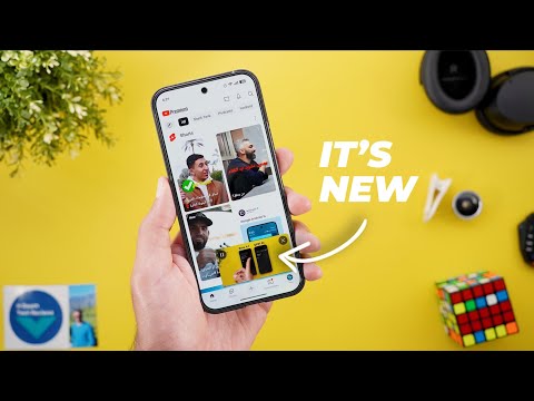
The second change is under search. Now, when I scroll down, I see this new section called you may like that gives more suggestions based on my search history. Now, let's talk about Google Chrome. And here I'm going to show you three new changes. I will start with the new changes under the tab switcher. And the first one, when you tap on the ellipses of any group, you will see a brand new delete option that didn't exist before. And when you tap on it, it will give you an overlay card to confirm your selection. And it also says that this will delete the group from all your devices signed in to your Google account. And you have the option to avoid showing this card in the future by checking the do not ask again. The second change is related to the dynamic theming. And you will notice here that the colors are more subtle than what it used to be.
For reference, here's another phone using the same exact color palette and wallpaper. And you will see here that the green accent color is less saturated in the newer version. And the same applies to the background. And lastly, the Chrome shortcuts widget got one more button when you add it to the home screen and stretch it to the full width. You will see here that now I have Google Lens as one of the shortcuts, which wasn't the case before. And for reference, here is how it used to look before the change. The next app we have is Google Meet. And here I'm going to show you five new changes. The first change I'm going to show you is the new meet calling experience. This feature is not available for everyone just yet. And that's why when you try to call a contact that didn't get this new change, you will see a banner at the top saying this will start a legacy call.
And when you tap on what's this, it will show you a card explaining what's going on. Says here new meat calling is coming. Legacy calling, previously known as Duo, is being replaced by the new meet calling, featuring in call chat and more. But you still can use the legacy call up until this feature becomes available to everyone. This legacy calling page gives you the option to send emojis. And when you tap on the send button, you can send a photo or a video using any of the effects you see now on the screen, a note or a voice memo.
But when you try to call one of the contacts that got the new feature, like this one for example, you will see a totally different page. First, the viewfinder is much bigger and we have this new shield icon that when you tap on it tells you that this call is cloud encrypted. The buttons have a different design and when you swipe up, you will see another toggle that adds end toend encryption but limits features. So, if you want to make your calls extra secure, you can activate the toggle. And all the styling options are hidden under this menu that you can expand like this. You have backgrounds, filters, and appearance. Let me also show you some new changes inside meetings. When you tap on the ellipses, you will see that the activities option is now called tools.
And when you go inside, you will see some differences in the categorization. Now it has separate categories for the live sharing options. We have Google which includes YouTube installed add-ons that includes Cahoot and then I have the two other options for live sharing. So as you see here the list is now categorized and one minor ch minor change here is the add others title has been removed from the newer version. Last but not least, Google Meet on the web got a new realtime speech translation feature that you can access by clicking on the side menu button and then you choose speech translation. But keep in mind that this feature is currently in beta. It only supports English and Spanish and it requires Gemini advanced subscription which is currently known as AI pro. Once you click on the enable translation for everyone, it will take you to another page to choose the language you speak and the language you want to hear.
So you can speak and hear the other person in your own language, similar to the interpreter mode we have in Google Translate app. By the way, if you like any of the wallpapers you see in this video, they are now available in the wallpapers by in-depth tech reviews app. And recently I added some greatl looking wallpapers as shown over here. And soon I will give you the option to download these wallpapers to your device to be able to use them with the new effects of Android 16 which will make things even better. You will find Google Play Store download link in the description. And now let's get back to Google apps. Now let's talk about Gemini. And here I'm going to show you three new changes. The first change is the ability to access Gemini Live using a new gesture. While in the app, all you need to do is to swipe left. it will start Gemini Live and swipe the other way around to close it. The second change is the rebranded and upgraded Gemini subscriptions. Gemini Advanced is now called AI Pro and there is a brand new subscription called Google AI Ultra.
So, if you want to know more about the new features added to the AI Pro subscription and what's included in the AI Ultra, you can head over to the profile menu and then updates. Scroll down until you find the AI Ultra plan. announcement which is over here. Then you will get an idea about what features you get access to. As per the description, AI Ultra will give you access to the best Gemini models including 2.5 Pro, deep research, video generation with VO3 and 1 million token context window. Plus, you will get 30 TB of storage and early access to some AI innovations like Project Mariner. Moving to the AI Pro, it's not just the name a change, but Google will give you access to more powerful tools like notebook LM, Whisk, Flow, and more.
You can also generate highquality videos with sound, but the videos are limited to 8 seconds, and it will use Veu 3. Plus, the image generation model got updated to imagine 4, which will give you higher quality. You will also notice that now I got this new pro tag next to my profile picture on all Google websites because I'm already a Gemini advanced subscriber and I've been migrated to the new subscription. But unfortunately, I didn't get any of these features to show you. But I will keep you posted in my future episodes. And if you want to know more about the pricing and the included storage, I recommend checking this article from 9to5 Google that I'm going to leave its link in the description below. It will give you a side-by-side comparison between the two to see the differences. And the last change I'm going to show you in this chapter is only available on the web. When you go to gemini.google.com and then go to the side menu, now we have a search bar for the chats.
When you tap on it, it will show you the most recent chats with the date and you can type your search query which will make your life a lot easier. But unfortunately, this feature is not yet available on the mobile app. The next app we have is Google Calendar. And here I'm going to show you two new changes. The first change is a visual tweak. Now, when you tap on the plus button at the bottom right corner, you will see a redesigned menu.
And for reference, here is how it used to look. Now, we have more rounded and bigger buttons with an X to dismiss the menu instead of tapping anywhere on the screen. The second change is under settings and then general. When you scroll all the way down, you will see a new toggle called share Google calendar data with other apps. This option will allow you to stop third party apps from accessing your calendar data at any point of time. But keep in mind, this toggle doesn't impact Google apps. Now, let's end this video by talking about the apps that only got one new change. And I will start with Google Messages. Now, when you try to send a selfie, Jeff, you will see this new record button. So you can make yourself ready before starting. While previously when you do the same thing, it will start the recording immediately.
Next, quick share. Now when you go to the quick share settings, you will see a new toggle called use mobile data. It says continue sharing if your device can't connect to Wi-Fi. Data charges may apply. So, for example, if you started a sharing session with your friend and both of you went out of range, you still can continue the sharing process over cellular data without dropping the connection, which is a very handy feature. Moving to Google Wallet, this is the only app I came across that got the brand new profile menu of Material 3.
So, let me show you how it looks. First, it has a brand new animation that slides from the side of the screen. The other accounts you have are combined together under one container that you can expand or collapse. Then you have the rest of the items and when you tap on any of the options as you see it will animate to the side as well and then show you the page you are heading to.
Moving to the Google app and we are back again to the same old full width design of Google Discover instead of having the narrower and more rounded cards design that we had just before this one. Not only this, but Google made the website name at the top instead of the bottom with a bigger icon than before. The next app I have is Google Maps. I recently used it to navigate somewhere and I started to see a new animation while driving. You will see here that it will start with the bird's eye view and then once I start turning it will angle the camera and then return back to the same view once I drive back again in a straight line.
To me it looks very similar to Apple Maps which never been the case before. So please let me know in the comments if you think the same. The next app is Find My Device, which is now called Find Hub to match the same name Google announced in the IO event. I didn't spot any new features in the app itself, but you can also see the same change under settings and then security and the privacy and then device finders. You will see that now the name is Find Hub. Last but not least, I came across this brand new notification on YouTube Music while playing one of the automatically created playlists and after skipping multiple tracks, I got this banner saying, "We have updated your upcoming music and then it disappeared after a few seconds." I think it's related to the dynamic Q feature that automatically updates your queue based on your behavior, but I'm not 100% sure.
So, that's pretty much it for today. These are all the new features I wanted to show you in Google Apps. Please reach me out on social media if you spotted any new feature so I can include in my future episodes. But for now, thanks so much for watching and see you in the next.