This is Google Apps updates roundup number 113. In this episode, I will show you 34 new features in 15 different Google apps. So, make sure your Google apps are up to date. And let me show you what's new. [Music] Let's start the episode with the YouTube app. And here I'm going to show you three new changes. The first change is under the subscriptions tab. Now you will see a new carousel called most relevant that will give you multiple options while previously we used to get only one option in the same area. The second change is the availability of a new experimental feature called comment threading which you can try if you have a premium subscription. It says here comment threading provides a more focused reading experience and helps users easily understand conversations. It says, "Click on the X replies button under a comment and view threaded replies in the replies panel.
Only available on iOS and Android." And here is a quick example to show you how it works. When you open the comments section and see any replies like this, when you tap on it, it will show you the replies in a threaded format. And lastly, when you open any of your playlists and try to edit the thumbnail like this by capturing a custom photo or choosing one from your gallery, Google moved the styling options in a pill container located at the right side instead of showing under the image like before.
And you can do pretty much the same things. No difference here. Next, we have Gemini. And here I'm going to show you four new changes. The first change is the ability to access Gemini from the overlay card that you get when you trigger Gemini using the power button. You will see here a small handle that when you drag with your finger, it will open the app in full screen view. But once you start talking, the handle will disappear. So you don't have the ability to access the app using the same gesture. Then we have two new changes related to Gemini Live. The first one is a feature loss. We no longer have the ability to swipe left to access Gemini live like before, but the second change is a better video resolution in the live camera feed. And lastly, now you can convert any still image into an 8second video in 1080p resolution with the help of VU3.
And this feature is available for the AI Pro and Ultra subscribers. I created a dedicated video talking about this feature. So, I'm going to leave its link in the description if you want to know more. But let me show you a quick example. I gave Gemini this image and I typed make the dog jump and play. After a couple of minutes, it generated this video which has an impressive quality and realistic movements. But the problem is even if you are an AI pro subscriber, you get a very limited allowance. For example, I only created four videos and then it didn't allow me to create more. So, you might need the ultra subscription if you want more allowance, which costs more than $200, which is very, very expensive. And that's why I would like to introduce you to a much affordable tool called Clipwise.
It's an AI tool that lets you create short viral ready videos in just 3 minutes with no editing skills needed. You can make faceless videos, AI hosted content, Reddit style explainers, and even interactive quizzes, all from a simple formbbased interface. Just type your idea or paste a YouTube link, and the Clipwise handles the rest. Scripting, visuals, voice over, even video generation. You get lifelike voice overs, voice cloning, theme customization, background music, visual effects, and even modebased editing. It's 10 times more affordable than tools like Veo3 or Invido and right now there is a 60% discount on the annual plan. If you are serious about content creation, this is your moment to jump in. So whether you are starting a new channel or just want to scale your content without burning hours, Clipwise is the smartest way to ride the AI wave. Click the link below to try it out. And trust me, your next viral video could be just one prompt away. And now let's get back to the video. Next, YouTube Music.
And here I'm going to show you four new changes. The most exciting change is the ability to transfer your playlists from other services to YouTube Music. To achieve this, you need to go to the library tab. Scroll all the way down and you will see a new banner called transfer playlists from other apps. Tapping on it will give you plenty of options to choose from. Here we have the first six services.
And when you tap on more services, you will get even more as shown now on the screen. And you still have the ability to enter the song names by hand. And you can achieve this by tapping on the free text option. And it will give you an example on how to format your text file. You also have the ability to upload text files to YouTube music.
And it supports these formats, TXT, CSV, and so on. And lastly, you have the ability to use a URL which will allow YouTube music to pull the information from. The second change is under the samples tab. Now the videos play in full screen view. As you see, they are showing under the status bar which gives it a more immersive experience. The third change is under the home tab. And when you scroll down a bit, you will see a new card to create a radio by picking multiple artists by just tapping on them like this. And then hit the play now button. And if you want even more options, you can tap on the more button. And when you do the same, you will see all your selections at the top left corner. Here you have the ability to filter to modify the options. And then when you tap on done, it will create the radio for you. ready to play. And lastly, the now playing screen got a small visual tweak. Now when you activate the shuffle or repeat options, you will see a small dot under the icons.
And this what happens when you activate the one-time repeat option. Next, Google Photos. And here I'm going to show you five new changes. The first change is related to the widgets picker. Now you will see real photos from your gallery in the widgets preview. The second change is the smaller memory carousel when compared to the previous versions. The third change is under the albums page. Now we have a dedicated search for the albums. Unlike the appwide search, this one will give you more specific results.
And the Google Lens integration got a new behavior and interface. Previously, tapping on the lens button used to take you right away to the text selection page, but currently it takes you right away to the visual matches where you can ask about this image or use the translate option. But if you want to select text, you need to dismiss this card by swiping down.
It will show you the same exact options at the bottom with the ability to select text from here. So, it got a new behavior and look. And lastly, the system photo picker got a very handy feature that I've been waiting for, which is the ability to search for photos inside the photo picker using the search bar at the top, which will give you full access to Google Photos search functionality, where you can filter by people, locations, or any search term that comes to your mind. Now, let's talk about Google Messages. And here, I'm going to show you multiple design tweaks and one new feature. Google messages is getting closer and closer to the full material 3 expressive experience and let's start with the home screen and for reference on the left I have the previous version the first thing you will notice here is the updated logo now it has a container around it then we have a much bigger profile pictures and also when you take a look here at the search you will see an updated grid which is something I mentioned in my previous video also when you take a look at the messages list.
You will see more rounded corners unlike the sharp ones in the previous version. The start chat page also got redesigned. Here you will see a new search bar. The create group button is thinner and wider. Then we have everything else in its own container including Gemini and the contacts. The settings page also got the same treatment with separated items and much bigger toggles. And in Magic Compose, you will see noticeably bigger feedback buttons on the left. So, these are the visual changes I got so far, and there are more to come in the future. So, I will keep you posted in my future episodes. But let me show you one new change as well in the plus menu.
Now, we have the gallery and the camera options separated. When you compare this to the previous version, we used to have only one option for the gallery that gives you access to both. But now you can access the gallery separately if you want. And this what happens when you tap on the camera option, which is pretty much the same one we used to have. Before jumping to the next chapter, if you like any of the wallpapers you see in this video or any of my previous videos, they are now available in the wallpapers by in-depth thick reviews app. Plus, now you have the ability to download any of the wallpapers locally on device to apply the wallpaper effects of Android 16 on them. All you need to do is to hit the download button right here. You can also apply any of the edits you want on the wallpaper before downloading and enjoy the app editing tools to give your wallpaper a new look. You will find Google Play Store download link in the description.
And now, let's get back to Google Apps. Now, let's talk about the phone app that got a brand new layout that makes it easier to use. Let's start with the homepage that got most of the new changes. And for reference, here I have the old design on my Pixel 4 XL. The first thing you will notice here is the removal of the favorites tab and it got replaced with a carousel that you can scroll horizontally. And if you want to add a new contact, you can see the add button at the end of the list instead of having a text button at the top right corner like before. Plus, you can expand or collapse the favorites carousel. The second change is the removal of the contacts tab and now we have a text button at the top right corner.
You will also see some design tweaks here like the create new contact button is now called create contact and it has its own container. When it comes to the keypad, we used to have a floating button that you can access anywhere which is no longer the case. Now the keypad is a separate tab in the navigation bar and this is how they look side by side. In the previous version, the tabs at the bottom disappear, but you can still see them in the new design. And lastly, the ellipses at the top right corner got replaced with a side menu. From here, you can access the contacts, which is another way instead of using this text button with the same exact options like settings, clear call history, help, and feedback. But you'll notice here that each item now has an icon, which wasn't the case before. I didn't get the redesigned call page just yet, but I will keep you posted in my future episodes. Next, Google contacts. And here I'm going to show you two new changes.
The first change is under the contacts page. So, when I open any of the contacts and then scroll down, there's a brand new recent activity section that will show you the most recent calls and messages. And when you try to add a new contact and scroll all the way down, you will see this redesigned saving to section that will allow you to check which Google account you are going to save your contact to. Now let's talk about Google app.
And here I'm going to show you six new changes. The first change is related to circle to search. Now when you do any song search, you will see a new history button at the top right corner that will take you right away to your song search history. Then we have two new changes in the AI mode. The first one is the new history button that will show you the full list of searches you did before. Plus, you have the ability to delete individual items or you can also clear the search history by tapping on the ellipses or manage your Google search history from your Google account page.
And the second change is the ability to attach photos either from your gallery or by using the camera. And this is how it works. Change number four is related to the at a glance widget. Now you can make it thinner and when you do the weather container will get a different shape. But if you want the same previous shape you need to make it bigger. Plus Google no longer allow the width adjustment like before. Change number five is the redesigned Google lens.
And now we have a much simpler layout with only two tabs at the bottom. And here's an old screenshot showing the previous design. We used to have a white bar at the bottom with three tabs, translate, search, and homework. But now we only have two, which are search and translate. They are in a floating container with a gray color. So overall, it looks much better. And the second difference is the smaller, more menu as you see here in comparison.
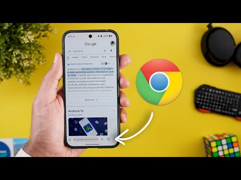
And we also got this new info button to check if you are donating your images to Google or not. Also, when you try to do a visual search, it immediately takes you to the visual results in full screen view. And you can dismiss the card by swiping down, unlike before, which requires a swipe up to expand. Last but not least, when you search for the Google app in the systemwide search on your Pixel, you will see this new search bar that will take you right away to the inapp search. And this feature I only got on my Pixel 9 Pro XL running QPR1 beta 3. Next, we have Google Chrome. And here I'm going to show you two new changes. First, we got one of the most anticipated features, which is the ability to move the address bar to the bottom of the screen. And you have two ways to achieve this. Either by tapping and holding on the address bar and then tap on move address bar to the bottom. And here's how it looks. It will move all the controls and buttons along with the address bar and it hides once you start scrolling.
And the second way is by going to Chrome settings. And here under the basics section, you will see a new option called address bar that will allow you to do the same. The second change is available on the desktop version. Now you will see a new grid button at the top left corner that will give you access to all the tap groups open on your other devices signed into the same Google account which is a very handy feature. Next we have Google Drive that started to get some of the material 3 design changes. You will see most of the new design changes when you open any of your documents like this one for example. So let me show you the previous design here on the left. You will see now we have an ovalshaped container around the buttons and the buttons at the top are bigger. Also, when you take a look at the bottom, you will see the same ovalshaped containers unlike the rounded rectangles. And when you try to add any text like this, you will see that the symbols are now surrounded with ovalshaped containers unlike before. And the numbers button has a bolder font and more vibrant color.
Now, let's end this video by talking about the apps that only got one new change. And I will start with Google Wallet. Now, when you tap on your payment card, you will see its full name and the last four digits in the header, which wasn't the case before. In Google Calendar, you will see a redesigned overflow menu. When you tap on the plus button, and for reference, here is the old design side by side. You will see much bigger buttons with rounded containers. The home app on where OS now gives you the option to create your own favorites list for your Pixel Watch separate from the one you have on your phone. And you can achieve this by opening the app and then scroll down until you find the edit button. When you tap on it, you will see an open on phone button. When you tap on it, it will take you to a page on your phone for your Pixel Watch.
Here you can choose what devices to add. And when you tap on next, you have the ability to reorder using the handles right here. And once you're happy with the changes, you can tap on save. Your Google account page also got the material 3 expressive redesign which you can access from any third party app and then go to the profile menu. Then tap on manage your Google account. You will see a completely redesigned page that has the same design language of the material 3 expressive. The Google services page also got updated. On any Android phone, you will see a page for Google services. In my case, I have it right on the top. And then when I go to the all services tab, scroll down under the privacy and security. There is a new page for system services. This one include any system services related to Android. And from here you can update any of them by tapping on the uh apps listed under the available updates section.
And you have another one for the up-to-date services. So for example, I need to update my Google Play Protect service. So I can go to this page and update it. Same as the Android system web view. And finally one more update for the Android system key verifier. So you will see all the Google services over here in one place. So you can update them at any time. So that's pretty much it for today. These are all the new features I wanted to show you in Google Apps. And if you spotted any new feature, please reach me out on social media so I can include them in my future episodes. But for now, thanks so much for watching and see you in the next.


