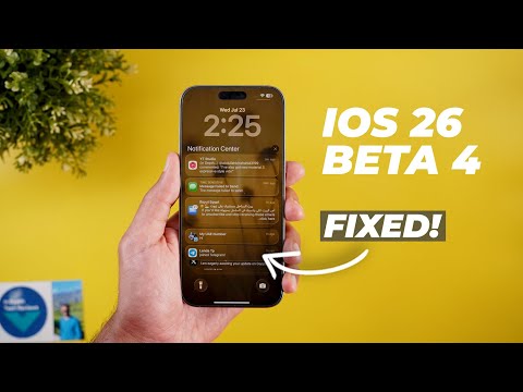
Hello everyone and welcome to the channel. Today Apple released the fourth developer beta of iOS 26 that I have here on my 16 Pro Max to show you everything new. So without further ado, let's jump in. Starting with the update size and build number here on my 16 Pro Max. The update size is 2.2 GB moving from beta 3 to beta 4. And the build number is 23A5297i. And now let's take a look at the new features. The first change is the new wizard you get with the first boot after updating the phone. It will take you through multiple steps to choose the type of notifications you want to summarize. You can choose between three different categories. News and entertainment, communication and social, or all other apps. It will show you some of the apps included under each category and you can choose either one or multiple.
The only exception here is the news and entertainment category has a disclaimer that says summarization may change the meaning of the original headlines verify information which is not the case with the other categories. The second step in the wizard gives you the option to activate the priority notifications which will allow iOS to use Apple intelligence to identify the most important ones and place them in a separate section on your lock screen. And finally, a quick guide on how to trigger Siri using the power button or by doubletapping the home bar for typing. Now, let's talk about the new changes in the lock screen. And the first thing I noticed is when I swipe up to reveal the notifications, you will see here that the background becomes noticeably darker than beta 3. Plus, Apple added a very smooth transition between the bright and dark background. It helps a lot with the readability and I'm really happy to see this happening and I think this is a very smart idea from Apple to solve one of the biggest issues of iOS 20 26 which is reading the notifications.
As you see, it looks much much better now. It's also worth noting that the OS now darkens the whole background, not only the part behind the notifications. And to show you a side-by-side comparison, here's a screenshot from DP3. And as you see, the part at the top and the bottom are not very dark, but now when you switch to beta 4, you see a massive difference. Now the whole background is much darker and you can easily read the notifications.
But when it comes to apps, it's a different story. It seems like Apple is reverting back to the liquid glass look in apps like Apple Music. As you see here, I have a screenshot from developer beta 3 and it looks like a frosted glass, but now after installing beta 4, it looks like liquid glass we originally got in the first developer beta. When it comes to the control center, I don't see any difference between the two. This is beta 4 and here is beta 3. They look exactly the same. Back to the lock screen, I spotted few changes related to the iOS 26 wallpapers. When you tap on the plus button to add a new wallpaper, you'll see that the iOS category is now called iOS 26. And you see the wallpaper is dynamically changing, which wasn't the case before. Also, when you scroll down to the iOS 26 category, you will see a new description added saying multiple shades and materials play with light.
This wallpaper can change over the course of the day or you can choose a favorite. So for example, when you tap on any of them, the first option you get is dynamic, which didn't exist in developer beta 3. And then we have the rest of the options like shadow, sky, halo, and dusk. So if you want your wallpaper to dynamically change through the day, you can use the dynamic option. So let's add it to my wallpapers gallery. And this is how it looks now. At night, it looks darker and it should become brighter over time when the morning comes. And this is how it looks. Another visual tweak in the lock screen is the more transparent floating cards.
And on the left, you will see a screenshot from beta 1 showing the difference between the two. And also when you try to select widgets or customize the clock, all these floating cards are now more transparent. Moving to the home screen, I only spotted one new change. When you go to edit and then customize and then go to tented, you will see that the tinted icon reflects the color when you move the slider, which wasn't the case before. Now, let me show you some minor visual tweaks here and there across multiple apps. And I will start with messages. The first thing I noticed is the outlined mic icon instead of the solid one like before. inside the conversations. Now I have a new video call button that didn't exist before. And when you tap and hold on any message, now you have a quick access to the translate feature. Previously in beta 3 to do the same, you have to select the text first and then use the translate option in this overlay menu. And lastly, the overlay menus in beta 4 are now more transparent in comparison to beta 3.
Moving to Safari, there are a couple of visual tweaks. The first one is the more transparent address bar to match the liquid glass design language we originally got in beta 1, which is the case in multiple apps, by the way. And as you see, it reflects what's behind it, unlike beta 3 that used to have a more opaque background. Plus, I think the buttons in the address bar are now smaller than before. Talking about the smaller buttons, the camera app also got the same treatment. And you'll see here that the buttons at the top right corner are much smaller than the ones used in beta 3. Moving to Apple Maps, we got a lot of design tweaks.
For example, when I open any of the places now, we have quick access to the ratings and you can also see the rating score. Tapping on this button will immediately jump to the ratings section. Also, the action buttons at the top are now getting a light blue background color to make them more visible. And when you scroll down at the very bottom, you will see redesigned buttons with a rounded container around them, unlike before. Also, the delete button here at the bottom left corner is now using a tick sign instead of the trash can.
And I'm not sure why it's doing this because this button deletes the location. So, this one could be a bug. And when you start the navigation like this, it will quickly show you the share ATA button briefly here at the bottom of the screen and then it disappears after 20 or 30 seconds. Instead of having it buried under the menu, you get quick access to it for a while and then it disappears. The directions card at the top no longer shows the next direction, but you have to expand it like this. And that's pretty much it. Before jumping to the next chapter, if you like any of the wallpapers you've seen in this video, they are now available for sale on my Patreon page. And I'm going to leave the download links in the description if you are interested. And now, let's get back to the video. So, these are all the new features I spotted in the fourth developer beta.
Now, let's talk about the performance and battery. based on my experience while filming this video. Once more, my iPhone 16 Pro Max started to get warmer than expected with more battery usage because Apple reverted back to the same liquid glass design language we've seen in beta 1 and beta 2, while beta 3 was better in this matter because it was using more of a frosted glass design that was less intense on your CPU. So, I don't expect this build to have better battery life. it's actually going to be worse in my opinion. And also, the system is very glitchy. As you see here, even when I scroll my home screen, I have some dropped frames, which doesn't look nice. And I did spot this issue in multiple apps while filming this video. So, that's pretty much it for today. These are all the new changes I wanted to show you in iOS 26 developer beta 4. Please let me know in the comments if I missed anything..