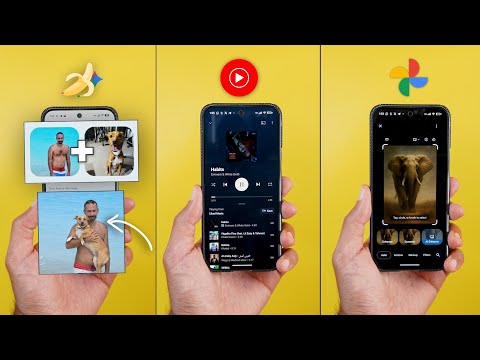
This is Google Apps updates roundup number 117. In this episode, I will show you 50 plus new changes in 17 different Google apps. So, make sure all your apps are up to date. And let me show you what's new. [Music] So, let's start the episode with YouTube Music, which you got seven new changes. The first change you will notice is in the home screen.
And when you take a look at the top carousel, as you see, it's now a lot smaller than before. Not only this, but Google also updated the background of each and every one of them. So when you compare this to to the previous versions, you will see that all of them got updated and they look different now. And here is a quick preview of each one. The second change you will notice is this new arrow next to the speed dial section, which wasn't the case before. Now when you tap on it, it takes you to a separate page. So you can see all the options in a two columns grid instead of only relying on the carousel. We also got this updated section that will allow you to quickly start a radio by selecting multiple artists. Plus, you have the ability to tap on more to see all the available options and the ability to search for whatever you want in here.
Plus a lot of other new sections that I've never seen before, like the shows for you. And when I scroll further, I got a new one here as well called music channels you may like. And it's giving me the channel name and three songs from the channel. And when I scroll further now, the from the community section is a carousel with multiple options. Previously, I used to get only one card, but now I have plenty of cards to choose from. And then we can scroll even further. And this is a brand new section as well called your daily discover. And as you see in this one, the thumbnail is a lot bigger. And the music or the album art is animated. So when you stop on this card, as you see, it animates the album art. Then you will see here the reason why this option is recommended.
It says because you liked something else. And on this one, it says that for fans of wigs. So, as you see, it gives you a reason why these songs are recommended. And lastly, there is one more new section here called most commented tracks. And it will show you the track and the comment, so you can listen to it as well. And when I scroll further down, I also got the June to August recap of 2025. It's pretty much the same recap we got used to. You get the same story like experience giving you some of the statistics and you can download it or share it if you want. But the most exciting change in this chapter is the updated now playing screen. When you take a look at the pumm, we no longer have the three tabs like before, but all we got here is a small handle and a text. When you drag your finger over the handle, it will reveal the up next songs. And you can make it 50/50 like this or dismiss it using the handle.
Plus, this new text is dynamic. So, for example, when I play songs from my June August recap, I can see the playlist name over here. And when I tap on it, it also reveals the up next songs without the need to drag my finger, which is easier. Also, when you play your music from another source, let's say your liked playlist like this, it will say liked music. And when you play it from a radio, you see here it says radio. So, it depends on the source, it will show you the playlist name. And if you want to access the lyrics, now you can find it in the carousel under the progress bar. Once you tap on it, it will expand like this. And when you look closely at these buttons, you see they are now much smaller. Plus, we no longer have the song video switcher at the top. But when you switch to the landscape orientation, you can get access to it like this. Or if you want to access it in the portrait orientation, you will find it as an option here.
And when you tap on it, it will show you the video in portrait view. The next app we have is Google Photos. And here I'm going to show you six new changes. The most exciting change in Google Photos is the redesigned photo editor I first got on my Pixel 10 Pro XL is now available on all Android phones. And as an example, let me show you how it looks on my Pixel 7a. When you open it for the first time, it will start by showing you this wizard for the first time to let you know how to exactly use it. It says here, crop as soon as you open. Drag from the corners to crop your photo right away.
And when you tap on next, it will tell you that now you have something called AI enhance, which is an all-in-one edits with AI enhance. In just one tap, you get effects like unblur, portrait blur, and erase all done for you. And then when you tap on next, it says select to edit. Tap circle or brush anywhere on your photo to erase, move, and more. And when you tap on done, it will take you to the editor. Surprisingly, I found all the features that one day were exclusive to the Pixel 9 models are now available on the Pixel 7a without a problem. So, for example, I have access to the autoframe feature. I can use re-imagine, same as Magic Editor and AI enhance. And that's exactly why I said in my Pixel 10 Pro XL review, there is no point for me to pay a flagship price for a phone based on the software features because here you go.
Now you can use the same exact software features on a 3 years older chip without a problem. So instead of Google trying to convince people that Tensor G4 or G5 is the reason behind these AI features, they better use a higherend hardware that matches the price tag. But anyways, let's get back to the editor. At the top left corner, you will see this button that will give you access to the autoframe feature. And you can also rotate the image from here. When you tap on autoframe, the AI will generate four different options to choose from with the ability to regenerate more if you want. So, let me show you how it looks. You will see all the options here to switch between them. And you can regenerate more from here. Also, we have the ability to adjust the aspect ratio to mirror, rotate, and we got this new AI enhance feature that will use multiple tools together to make your photo as good as possible, not like the previous AI enhance feature that we used to have.
In this one, um, it's also using the autoframe feature, not just the other editing tools. So, it's a really nice touch and it gives you three different options to choose from and you can quickly switch between them and you can check the original like this. After that, you will see all the options available under multiple different categories. We have actions, markup, filters, lighting and color. And if you are not able to locate the tool you are looking for, now you have the ability to search.
So for example when I search for umblur I can get access directly to it and as you see it works immediately. Not only this but the sliders also got updated and here is how they look now. And when you go to the filters you will see that now we have two categories. The normal filters and when you tap on any of them it will change into a controls button which will also give you access to a slider to adjust the intensity. And then we have the sky styles which are exactly the same as before, but the interface looks different. So that's in a nutshell how the new editor works and I'm really happy with this new design. It makes a lot more sense than before. The memories also got some really nice features that I personally like. The first one is the thicker progress bar at the top. And here is how it looks.
And when you pause the memory or move back, two things will happen. First, it will say paused at the top left corner. And this is how it looks. Plus, two buttons will appear at the bottom left corner. One button will allow you to add this photo to favorites. And here's how it animates. And the second one will take you to this day in your phone's gallery. But not only this, you will see a banner here at the bottom of the screen that will take you back to the memory once you finish whatever you're doing here to the exact spot where you left off, which is a very smart idea. The third change is the redesigned cleanup wizard. Sometimes you get this banner at the top that will help you clean up your library. When you tap on review, you will see a totally different design. In this case, it started with the blurry photos. It's showing me the total number of photos in question.
Then I have the current one, the size and date. And then I have two buttons, either to delete the photo or keep it. And at the bottom it says delete items to make room for new memories. And it's showing me the total number of space I can save when I delete all these photos. So for example, when I tap on keep, it takes me to the second one. And as you see, it gives me this heart animation. And then I have the delete option. And this is how it looks. And you still have the ability to undo your action using the undo button at the bottom left corner. And here is how it works. The video player also got a nice little feature, which is the ability to double tap on the edges to seek forward or backward. Change number five is the C2PA credential support. And this feature is currently exclusive to the Pixel 10 models. When you scroll all the way down in the info pane, you will see this new section, how this was made with this tag at the top right corner.
It says here that the media captured with a camera and edited with AI tools. This new standard will help you identify if this photo is edited using AI or not. And when you take a normal photo like this one, for example, that doesn't say AI, but it says that media captured with a camera. And that's exactly the difference between the two. And the last change I'm going to show you is only available on iOS devices. Google is the only company that loves the competition more than themselves. So this feature is not yet available on their own Pixel phones just yet, which is the ability to tap and hold on the subject like this to copy same as Apple Photos. And as you see, it will give you the same highlight. And then you have the option to copy. And it says here sticker copied. Or you can tap on share. And here is how it looks. Before jumping to the next chapter, I would like to show you the latest pack added to the wallpapers by in-depth thick reviews app.
You can find them under the new featured category. And the reason I called these wallpapers featured because they look amazing on the lock screen with the new live effects feature of Android 16. So, all you need to do is go ahead and download the wallpaper locally on device and then you will be able to apply the live effects. And let me show you some of the coolest examples. Most of them are designed to work perfectly with the shapes effect. The transition between the lock screen and the home screen looks stunning. Plus, you will find a lot of new options to choose from. So, head over to Google Play Store to get your hands on the app and you'll find the Google Play Store download link in the description. Now, let's talk about Google app. And here I'm going to show you four new changes. The first change, AI mode is now supported in 180 countries. And I'm going to leave a link from Google's website if you want to check the full list of supported countries.
And the second change is the redesigned homepage. As you see, it got a much simpler monochrome design. The AI mode has the biggest chip, followed by the music search. Then we have one for the gallery. And of course, we still have access to Google Lens, which now only includes one tap for everything. No more other stuff like homework or shopping. And then you have the microphone as usual. And I think that your space area also got redesigned.
The items are slightly smaller and more rounded. Also, when you start scrolling, you notice here that the search bar elevates slightly and then turns into white, which is also a nice touch. The third change is related to AI mode. Now you can share your conversations as public links with others. So they can ask follow-up questions and continue with it. So when you finish your query with AI mode, as you see, I have this new share button.
When I tap on it, I get a banner at the bottom to prepare the link for me and then allow me to copy it or share it directly from here. And the last change is the updated discover feed, which you got some visual tweaks and also functional changes. The first change is the new follow button that you will see next to any YouTube channel X account any normal website like this one and so on. So if you have anything here that shares information you can tap on the follow button to be more specific or control what you want to see on your discover feed. Not only this but this will also help the algorithm understand your interests to give you better recommendations in the future. The second functional change is the ability to see information from more sources. For example, in my case, I started to see posts from X and you can see a little tiny X on top of the profile picture of this account. Also, the same applies to YouTube.
You can see a YouTube logo over here. Then we have recommendations from Google Play Store with a new install app button that allows you to install the app immediately from the same screen, which is a nice touch. Also, some people started to see recommendations from YouTube shorts, Instagram, and more. And the last change is related to YouTube previews. As you see, when it finishes, the continue watching button got updated, it's now using a text only. Instead of showing the red play button, and you can see the YouTube logo at the bottom right corner, also in monochrome color to match the new design language. Now, let's talk about Google Chrome. And here, I'm going to show you two new changes. The two changes are under the tap switcher. So, let me show you the first one. When you tap on the ellipses in any group, now you can see an icon next to each option, which wasn't the case before.
The second change is something I noticed, but I'm not 100% sure if it's something new or not. Now, you have the ability to tap and hold and get this context menu appearing on the screen. And the same applies to the tab groups. So, you don't need to hit the ellipses. Now you can use this gesture which will make your life slightly easier.
Next, Google Play Store. And here I'm going to show you two new changes. The first change is some of the text is now highlighted to be easier to see. For example, when you take a look here at the rating and the installed text, you see a highlight behind them which make it much easier to spot on the screen. And the same applies to the my apps page. When you try to update any of your apps, for example, when I tap on this one, you will see that the status is now highlighted. Same as the percentage and the size of the app. When you compare this to the previous design I have here on the S25 Ultra, you can see the difference between the two. The search page also got updated and now I see more colorful icons in this area under explore games and explore apps. And on the left, you can see a screenshot from the previous design. Also, I think that the trending searches and latest from your games, those two boxes got redesigned as well.
Next, Google search. And here I'm going to show you two new changes. So, take a look here at this redesigned search page side by side with the previous design. The first thing you will notice here is all these icons look different, same as the ones over here. So, all the icons now have a container around them. Plus, they are more colorful or have more saturated colors. Also, the carousel over here, it's no longer using a memory like interface, but you can just easily scroll through the photos and videos.
Not only this, but I got those two options right here, which is order pickup and order delivery. When I tap on any of them, it will automatically show me the app I can use to either uh make a delivery order or pickup. And when I choose the app, it takes me right away to the restaurant page inside this app, which is a very handy feature. Secondly, I think Google added some visual tweaks and options to make the search easier. So, for example, now when I go to images, I can see when this image got uploaded. As you see here, it says a day ago, 23 hours ago, and so on. And when I go to videos, I see them now in a list view, which is easier to handle.
When I go to shopping, I think these filters at the top got redesigned. They are now using a rounded rectangle shape. Then when you go further, you will see a new section for short videos which I didn't know existed. So overall, the search is getting a lot better now. Next, Google messages. And here I'm going to show you four new changes. The first one is the redesigned more menu. So when you open any conversation and then tap on the plus button, now you see that all the buttons are now using an oval shape instead of the rounded rectangles like before. And also when you go to the emoji page, as you see all these buttons at the top got redesigned. Plus the photo emoji tab got a new create button different from the previous one. And here is what happens when you tap on it. The next two features are related to the encryption.
So now when you open any contact and scroll all the way down, you will see something new called verify keys. And when you tap on it, it says scan the QR code on the other person's device and ask them to scan yours. The idea behind this feature is if your or the other person's SIM card is used in another phone, which could be a potential scam. The verification codes will no longer match, and you will get a note under the contact info page to let you know about this to avoid any potential scam. And if you want to know how the feature works, you can tap on this hyperlink.
It will show you the step-by-step instructions. And if you want to reveal your QR code, here is how it looks. And you can also scan the other person's QR code like this. And finally, you can compare the verification codes from here. And the second one is the MLS encryption support, which will allow the cross-platform RCS messaging between Android and iOS to be encrypted. And the last change is the redesigned Google messages app on where OS. So let me show you how it looks. First we have the start chat button. Tapping on it will reveal the contact list. And take a look here what happens when I scroll. It will jump from letter to letter. But once you wait few seconds until the highlight disappears, you will be able to scroll within this actual letter.
But when you move fast, it will jump from letter to letter, which is a smart idea. Also, when you scroll all the way up, you will get a redesigned keypad. And here is how it looks. Let's open one of the conversations. As you see, it also got the material 3 expressive. Those three buttons are now grouped together in the same container. And they got an oval shape. And here are the quick replies. And you can tap on more. As you see, it animates nicely. Then you get the call, view profile, delete conversation and open on phone. And this is how the new material 3 expressive of Google messages looks on where next Gboard. And here I'm going to show you three new changes. The first change is the ability to change your Gboard's font size without the need to impact your system font. So all you need to do is to go to settings and then preferences. Scroll down. You will see a new font size menu which will allow you to adjust the size.
Here you have multiple options or you can match the system if you want. And here you have a quick shortcut to set it back to default like this. The second change is the pixel screenshots suggestions in Gboard are now labeled. So let me show you a quick example. As you see it says pixel screenshots and it got this suggestion from one of my screenshots and you can tap and hold on the suggestion to know the source. In this case, it says magic Q suggestion. And this is the explanation. And here it says pixel screenshots. And when you tap on it, it takes you to the exact screenshot. And also you can do the same for text messages. So when you get any text message suggestion, when you tap and hold on it, it will tell you the source. So let me show you one of the examples. For example, in this Instagram conversation, I have some suggestions. When I tap and hold on any of them, it tells me how it's created. In this case, it's using the smart reply feature. The next app we have is Gemini. And here I'm going to show you seven new changes.
The first change is an amazing feature Google recently released called Nano Bananas. Beside the funny name, this feature will allow you to edit your photos in a whole new way. The first thing you can do is the ability to combine your photos. You can upload multiple photos to combine elements and blend them together in the same scene as shown in this example, a photo of a dog and a lady. And you can give it a prompt to make them in one photo. And here's another example that will allow you to reimagine everything, even how the person is dressing, how is the haircut, and everything. And the last thing, you can remix your photos which will transfer the style, color or texture of one object and apply it to another as shown in this example. Here's a photo of a flower along with boots. You can mix and match both together. So, let me show you some of the real examples in Gemini app.
First of all, this feature is available for free and paid users. The only difference is in the limit. The free users only get 100 edits per day, while the paid users get up to 1,000 edits. And here is some of the examples I created myself. So, for example, I gave it this photo of my son and his cousin, and I told him to make them fight. And here's the end result. As you see, it's very, very convincing, and I like what it came up with here. In the second scenario, it didn't do as good as I expected. I give it a photo of my dog and a photo of myself and give it a prompt saying create an image where the person in the first photo is cuddling the dog in the second one. And for some reason it generated three arms. It generated this new arm and kept the same two arms as before.
But I was able to rectify this issue by going to Google Photos then tap on edit. And I erased my arm using magic editor. So let me show you what I did. So after highlighting my arm, I tapped on erase and it did a great job in removing the unwanted arm. And here is the final result. As you see, everything looks more convincing now. And the last example I'm going to show you in this video is an image of myself and then a prompt saying, "Rimagine this person as a '90s artist." And here is the final result. As you see, it's not always great, but when it hits, you get some amazing results.
So, I'm planning to create a separate video about this feature. So, stay tuned for this one. So, the question is how you can use the new Nano Bananas feature in the Gemini app. You have two ways. You can either tap on this chip with the banana glyph icon called create image and it will activate it for you or you can simply tap on the tools button and you will see create images over here. And the next change is under the side menu. Now we have the normal new chat button and another one that looks like a dotted text bubble. When you tap on it, it takes you to a new feature called temporary chat. The description says temporary chats don't appear in recent chats or Gemini apps activity and aren't used to train models or personalize your experience. To help respond to you and keep Gemini safe, temporary chats are saved for 72 hours.
So you can consider this feature as the incognito mode in the Gemini app. Change number four is the ability to upload audio files to Gemini to ask a questions or summarize it. And you can do this by tapping on the plus sign and upload it locally from device or from Google Drive. I don't have any audio files to show you how it works now. But I tested it before and it works just fine. The only difference between the free and paid users is in the limit. Free users get up to 10 minutes while paid users get up to 3 hours. Change number five is the redesigned prompt box. I don't have it in my paid account, but once I switch to any free account like this one, for example, I have the new design. As you see, it's borderless and edgeto edge.
It has a slight shadow between the background and the box itself, but it works exactly the same. No difference between the two. And here's a quick demo on how it animates on the screen. Gemini on the web also got a redesigned box and now it doesn't show you the available options right away, but they are all hidden under a new tools menu. And here is how it looks to give you a cleaner look. And lastly, Google updated the Gemini support page and now you have the ability to know the daily limit of your current subscription and also the free users for all the features currently available in Gemini. The next app we have is Pixel Screenshots. And here I'm going to show you three new changes.
Starting with the app design, it got some of the material 3 expressive design tweaks. For example, when you go to collections, you will see it right here. The plus and back buttons are now surrounded with containers. And also when you multi select screenshots and then tap on the plus button, you see how it animates. It's a little bit bouncy. So the original design of this app was already close to the material 3 expressive design language, but it got closer. The next two features can be found under the screenshot preview page. The first one is the ability to read aloud your screenshot content. So here I took a screenshot from one of the articles by Android authority and I got the chip over here. When I tap on read aloud, you will notice that it doesn't only read the content of the screenshot, but it reads the full article because it has the meta data of this screenshot and it knows exactly which article it refers to.
And when you start the playback, as you see, it highlights the text in this blue color. Also, you have the ability to translate. And then we have seek forward or backward and the ability to adjust the speed. And here are all the available options. And the last change in this chapter is the new add to notebook LM shortcut. When you tap on it, it takes you to the app and gives you the chance to add it to an existing notebook or create a new one. So let me try to create a new one to show you what happens. And it says here the sources, website, and here is the article name. When you tap on it, it will reveal all the information for you.
Next, we have the clock app, which got the material 3 expressive redesign. Starting with the first tab, you will notice here that the alarm tab is now called alarms. And the same applies to the text under the icon. Also, the icon gets a solid color instead of using an outlined icon when you tap on it like this. Plus, we got a brand new animation for all other tabs.
When you take a look at the alarms, you'll notice multiple tweaks here. First, the alarms are better separated now. We no longer have the drop- down arrow. The plus button is no longer circular and centered, but it's now located at the bottom right corner. Also, when you activate any of these alarms, you will you will notice a new haptic feedback. Plus, the whole banner gets highlighted, not only the toggle like before. And when you tap on the alarm, now the card expands from the bottom.
And instead of expanding the actual alarm to the bottom like before. And when you tap on the time, you will see a redesigned A.M. and PM switcher. So, let's tap on this card to compare both. Here you will find that the days of the week are using a rounded square design. And when you highlight any of them, it turns into an oval shape. Here you have an edit button to edit the time. Or you can tap on the time right away if you want. Then we have the schedule alarm option. The alarm name is located over here. Previously it was at the top and called label. Then the sound option is now getting a title while previously it didn't. Then the uh check boxes that used to be here are now replaced with toggles but the functions are exactly the same. Also, if you want to delete the alarm, now you can see the button at the bottom left corner with a new save button because when you apply any changes here, you have to tap on the save button to apply them on the alarm.
Plus, we got a new animation when you swipe on the alarm to delete. As you see here, it looks different. And when you tap on the ellipses, you will see that each item now has an icon next to it. Moving to the second tab which is now called world clock. Not only clock like before and the title got updated as well. We got a brand new font here and the information that used to be right under the clock are now more separated. Google also dropped the high and low temperatures and you can only see the current temperature along with the date and the upcoming alarm. And lastly, the other locations are now labeled unlike before. Moving to the third tab which is timers. It looks the same at the first glance except for the font.
But let me show you what happens when you set a new timer. The progress bar got updated and now it animates differently as you see here. And there is a gap between the start and end points. Other than this, looks pretty much the same. No difference. Moving to the stopwatch tab. And here where things got out of control and Google decided to make the start button as big as the camera visor of the Pixel 10 or maybe bigger. I'm not sure. And here is how it looks when you tap on start. We got the same new font and a lot bigger reset and lap buttons. And this what happens when you add more laps. And when you tap on reset, it turns into a yellow color. And lastly, the bedtime tab looks pretty much the same. Maybe the schedule uh part got updated and it's now bigger than before. And this one looks different as well. But other than this, it's pretty much the same. Now, it's time to talk about the Pixel 10 exclusive changes. The first change is the removal of the daily hub feature from the Pixel 10.
I no longer have the shortcut in my discover feed. And also, when I go to settings and then system, I no longer see the daily hub menu. So, it seems like Google removed the feature to apply further improvements and then return it back. So, hopefully we will see better information in the future. Another change I only got on my 10 Pro XL and none of my previous phones, which is the new device health and support menu that you can find at the very end of your settings. When you go inside, the phone will automatically do some checks on the battery health, device temperature, storage, and software update and give you a consolidated status for everything and individual items as well.
When you tap on these items, they take you right away to the relevant pages. So here I have the device temperature, the storage, and finally the software update. When you scroll down, you have some extra diagnostics to do here like the charging diagnostics. And this is a totally separate app and wizard that takes you through some steps to do the troubleshooting. And you have another one for the touch diagnostics. And at the bottom, you can get access to the warranty tips and support or contact support. The third change is the removal of the extra dim feature from the Pixel 10 settings. And as you see here, I searched for that option and I don't see any related toggles because now the feature is integrated in the brightness slider.
When you make the brightness a lot lower like this, it will give you extra room to make it even darker without the need to toggle the feature on or off. Now, let's end this video by talking about the apps that only got one new change. And I will start with Google contacts. When you open any of your contacts and then tap on edit, then tap on the edit button next to the profile picture, you will find a new monogram option.
Here you can do a lot of things. First, you can put the initials yourself manually like this. Or you can tap on the inspire me option which will adjust everything for you automatically. And here at the bottom, if you want to do things manually, you have plenty of colors to choose from like this. You can also adjust the font. Then we have another option called emoji. And when you tap on emoji and then tap on it at the top, you can choose whatever emoji you want. And then you can adjust the background color. You can also make the emoji a monochrome. And here is how it looks when you do this. And then hit save. And this is the new profile picture of the contacts. The next app is Google Drive. And after getting the material 3 expressive, which I covered recently, we also got it in the document scanner. So, let me show you how it looks quickly by scanning this card. And you will see here that the buttons at the bottom got a new design.
And here's how they animate when you scroll. When you go to filters, here are the options. And you need to tap on apply. Then we have the automatic crop or no crop. Then we have the rotate. As you see the handles look different as well. Then we have the clean option. Here you will also get quick access to the delete and retake buttons. And when you try to add a new page to your scan, you'll also see here how the current page gets highlighted with the ability to reorder the pages if you want by dragging them like this. So there is no new functionality but you are getting a new design. Next, Google Wallet and we finally got a new tab to pay page instead of taking you to the app itself which is a lot better. So let me show you how it looks.
As you see now it animates from the side and the animation looks really nice. Let me show you this one more time. This is how it looks. Plus we have this gorgeous blurred background which looks better as well. Plus, you still have the ability to open the wallet app using this button if you want. Next, Google Maps on where OS got a really nice feature when you start the navigation and choose the walking directions. Once you hit start, as you see, it automatically shows the directions on your Pixel Watch, which is a real nice touch. I didn't do anything and the app started automatically.
Plus, you still can exit the navigation from here and also choose if you want to show the navigation on the watch in the future or not. Here you have the option don't show on watch, but I think this is a really nice feature and I recommend to keep it. So, that's pretty much it for today. These are all the new features I wanted to show you in Google Apps. And if you spotted any new feature in Google Apps, please reach me out on social media to include in my future episodes. But for now, thanks so much for watching and see you in the next.